
By Catherine Austin Fitts
My “go to” website for technical analysis of precious metals, the US dollar & the US stock market is Rambus Chartology, where Rambus (that’s his handle – he’s the founding technical analyst) leads a discussion with extensive charts of what the markets are saying.
In January 2016, Rambus launched his quarterly Solari Report with a Blockbuster Chartology. You can find links to the entire series of quarterly and annual Blockbuster Chartologies at the end of this latest piece.
One of the reasons that Rambus is so good at his craft is that he focuses on “staying on the right side of the major trend.” The challenge of doing so at this time is that it is tempting to look for bottoms or to assume that the trend upwards in the US dollar or stock market may be over. However, Rambus consistently brings us back to the discipline of the Chartology. What does price tell us? As he describes so aptly, we are dealing with psychological warfare.
Sitting back once each quarter to get this perspective offers invaluable insight. So, here we go for the Annual 2020 Blockbuster Chartology!
Blockbuster Chartology Quarterly Report
By Rambus
~ Annual 2020 Wrap Up ~
US and World Stock Markets
Commodity Indexes
An In-Depth Look At Gold
US and World Stock Markets
I’ve mentioned several times this year that we are living in one of the greatest times in my lifetime or in the history of the stock markets to be an investor. There is an old expression that states, there is a bull market going on somewhere if you know where to look. Well we have 3 bull markets going on at the exact same time so it is not that hard to find one.
For those investors that can keep an open mind and not get locked into how the markets are supposed to work based on previous history and fundamentals vs what the current price action is strongly suggesting have a decent chance of seeing the big picture. When you can see the big picture for what it is and not what it is supposed to be it opens up many doors you can walk through that will give you an advantage over those investors that can’t break the lock on the door that is holding them back.
I got into trouble years ago shortly after Goldtent was born by making a statement, there is more than one way to skin a cat, which didn’t sit well with one of the members and she let me have it. The point I was trying to make was, there is not a right way or a wrong way to play the markets as long as it works for you. Similar there is more than one area in which to invest in the markets if it is showing bullish characteristics which is currently happening right now.
We now have three open doors to walk through, the stock markets, PM complex and commodities. Each one of these areas has it own set of circumstances which makes its bull market unique. As you already know the stock markets and the PM complex are already in established secular bull markets but the commodities complex is just beginning the early phase of a brand new bull market that should have many years to run and will offer some exciting trades of its own.
Tonight I would like to focus on some long term charts for some of the US and world stock markets which are in the process of breaking out into new all time high territory after a several year correction in many cases. Keep in mind a correction or consolidation phase builds up the energy to launch the next impulse move. A lot of investors will see this sideways price action as a top that is sure to end the bull market especially if it has been in place for over ten years. The stock market just can’t keep going up because it has never happened like this before they like to say, but that is exactly the right sentiment the bull market needs to see to keep going higher
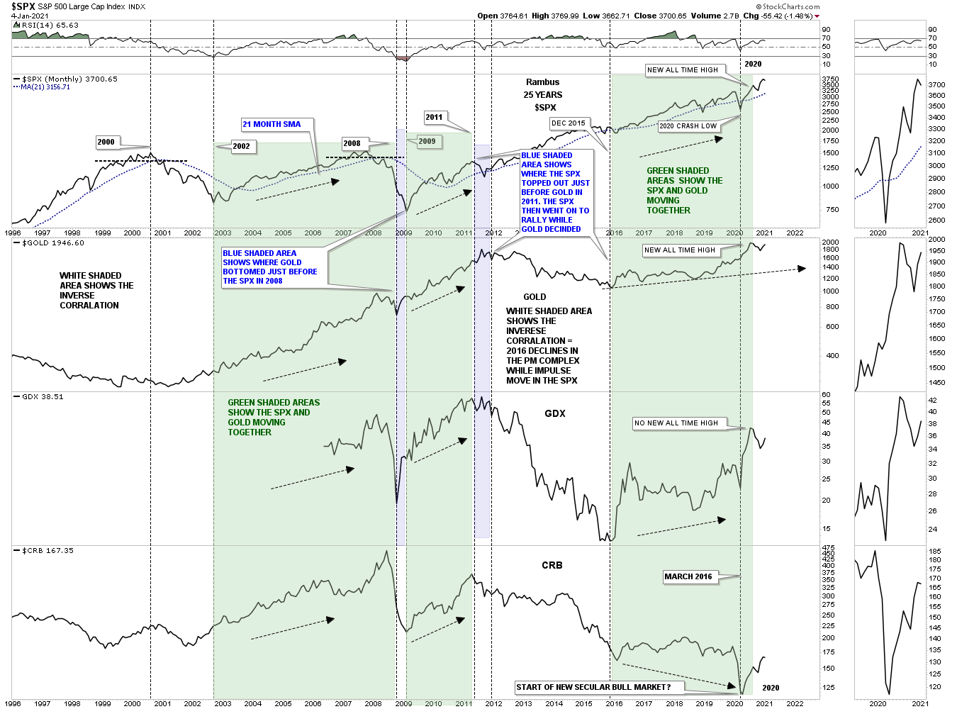
Before we look at some long term charts I would like to show this combo chart we’ve looked at before which has the SPX on top with gold just below. I’ve added two more charts the GDX and the CRB index for perspective. If you recall this combo chart shows how the SPX and gold can move inversely to each other or at times they can run side by side for extended periods of time which slams the door shut on investors that think the only way that gold and the PM stocks can go up is if the stock markets go down. I’m not going to go into great detail as we’ve looked at this chart many times in the past but I do want to focus on the price action since the beginning of 2020.
The green shaded area on the right hand side of the chart shows how the SPX and gold rallied to new all time highs since their respective late 2015 low while the GDX has yet to do so with the CRB index on the bottom just now beginning its new bull market. The rally in the CRB index may not look like much right now but I did a report on commodities a week or two ago which showed capitulation moves in most of the important commodities and commodity indexes.
For old time sakes some of you may recall I showed you this mechanical 21 month sma trend follower chart shortly after the 2020 crash. I was showing that if the SPX can close the month of April above the 21 month sma that we would have a new long term buy signal that could last for years. I remember we were all watching intently toward the end of April if we would get the brand new buy signal one month after the 2020 crash low. On the very last day of trading in April the SPX managed to just barely close above the 21 month sma for a long term buy signal which is still in affect.
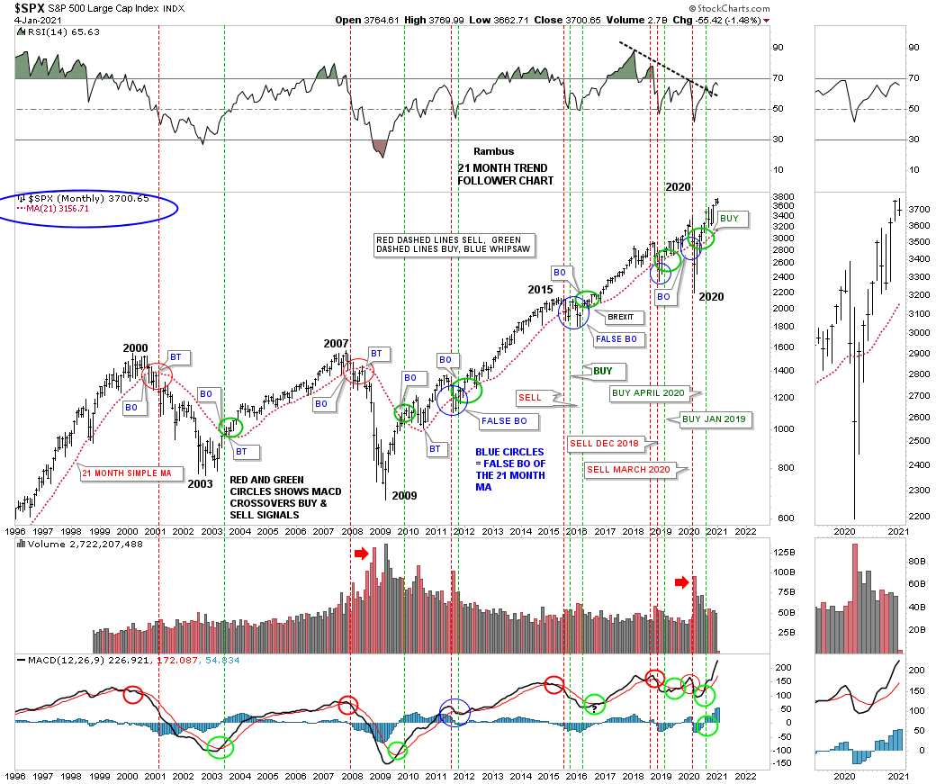
Below is the 21 month TREND FOLLOWER chart for the SPX which shows all the buy and sell signals since the 2009 crash low. The main thing to understand about his chart is how the 21 month sma works as a moving trendline. When you put a trendline on a chart it is stationary but when you look at the 21 month sma it is constantly moving. The 21 month sma still works like a stationary trendline. When a trendline is broken to the upside it will usually reverse its role to support once backtested from above and vice versa on a breakout below. The 21 month sma does the exact same thing. You can also see how well it works as support once the SPX trades above the sma on the backtest and as support as the impulse leg moves higher.
What I find remarkable about this simple mechanical long term trading system, that even a caveman can use, is how accurate it has been in calling buy and sell signals since the 2009 crash low. The blue circles show what I consider to be a whipsaw where the SPX closed the month below the 21 month sma and then above it the very next month for a one month sell signal. You can see the first one occurred in 2011 which lasted one month before the next buy signal that lasted until the 2016 correction which was one of the toughest for this 2009 bull market which had 2 whipsaws.
Once the SPX closed above the 21 month sma in April of 2016 that buy signal stayed in affect until 2018 where you can see a one month whipsaw. A month later another buy signal was given which lasted up until the 2020 crash which looked at the time that there was no way the SPX could rally back above the 21 month sma any time soon. But true to form a month later in April the SPX managed to close back above the 21 month sma and has been on a long term buy signal ever since. You can see the April 2020 buy signal if you look at the thumbnail on the sidebar to see just how close its was to triggering. Currently with just one more day of trading for the month of November the SPX is going to close at a new all time monthly closing high.
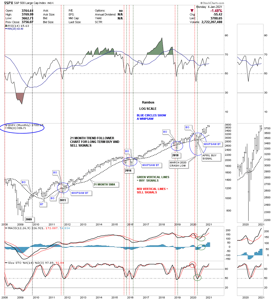
Below is the old original chart for the 21 month Trend Follower chart that goes back 25 years that I haven’t really had a chance to update properly yet but it does show you how you would have avoided the bear market that followed the 2000 high if you were using the 21 month sma. It would have also gotten you out before the 2009 crash and back in months later when the all clear was sounded.
Lets look at some long term charts for the US stock markets to see if the 21 month sma Trend Follower chart is confirming their bull markets. Keep in mind the 21 month sma only works on the SPX. I don’t have a lot of time to explain all the details but these charts to follow are pretty self explanatory. Just take a second to review the Chartology to see how bullish price action has been in control since the 2009 crash low.
NDX MONTHLY:

Most of you are familiar with the, Jaws of Live, massive consolidation pattern which dominated the long term chart from 2000 to 2013. This monthly line chart shows the recent consolidation pattern the INDU is currently breaking out of which I’m calling the, Baby Jaws of Life.
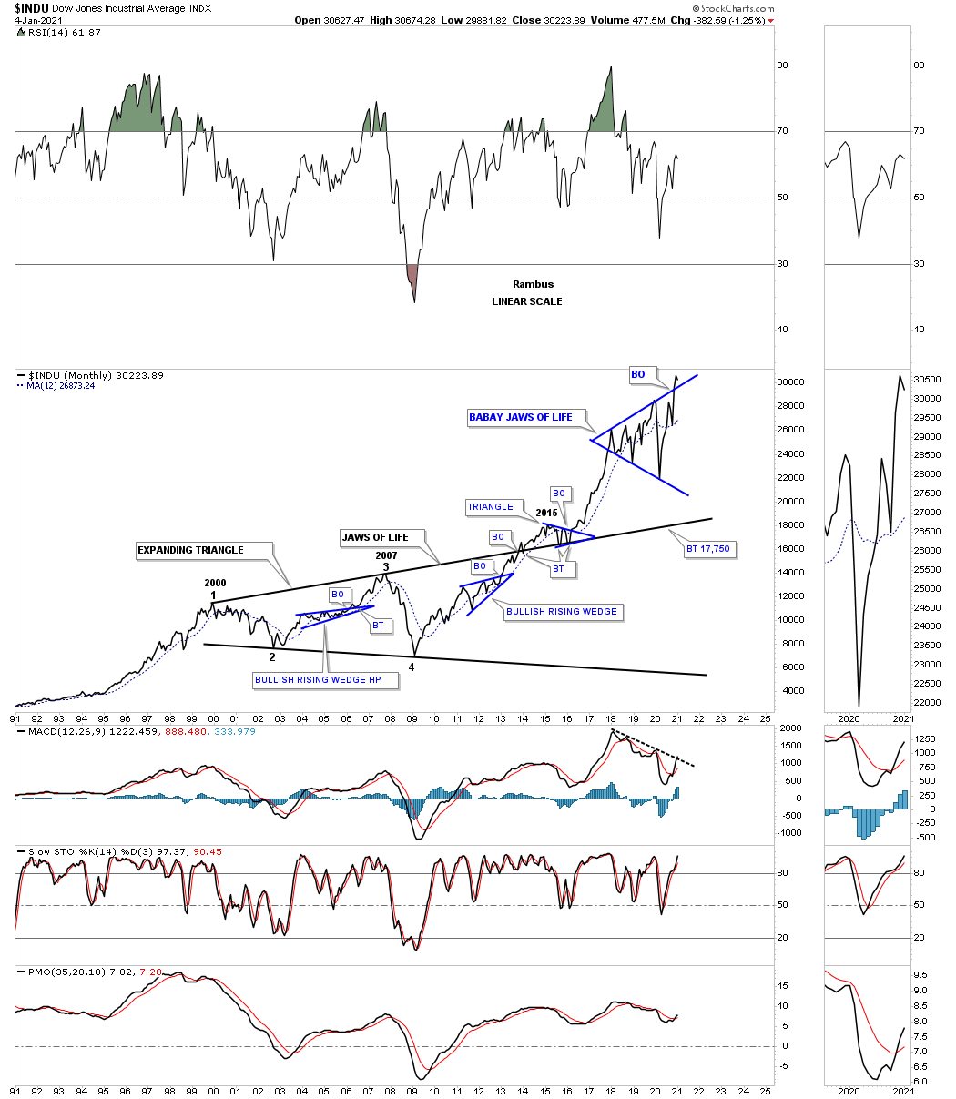
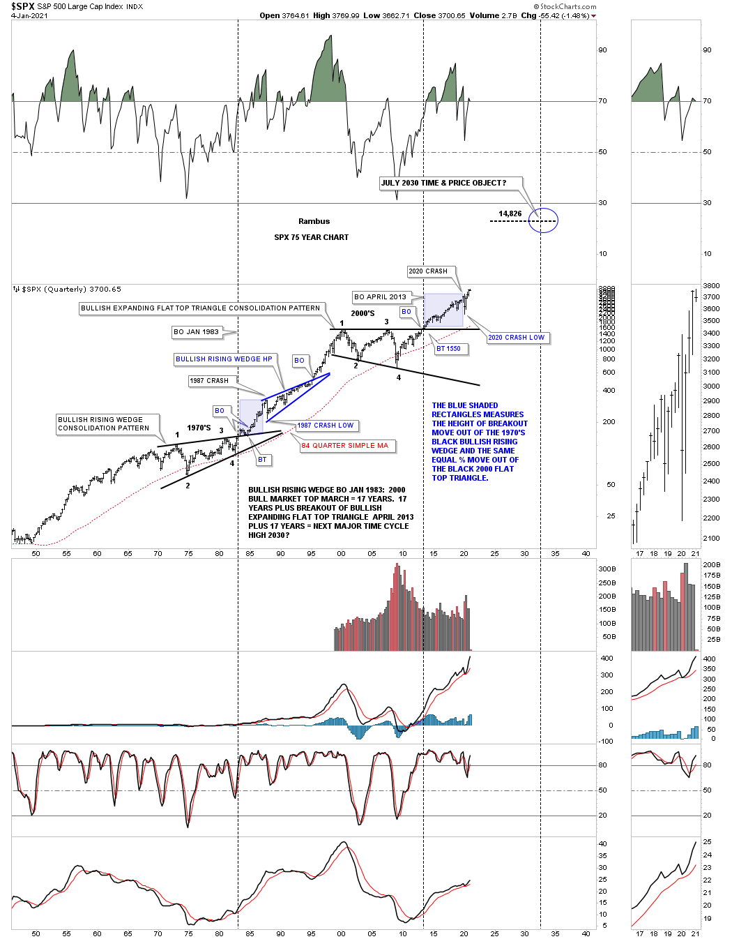
Next is a 75 year quarterly chart for the INDU which shows its secular bull markets. The first one ran from 1974 to the top in 2000. Our current secular bull market began at the 2009 crash low and is on going with the price action trading at new all time highs.

This 75 year quarterly chart for the SPX shows a similar secular bull market to that of the INDU. The only real difference is that the SPX broke out above the top rail of its 2000 bullish expanding flat top triangle with only a slight backtest unlike the INDU which took several years to complete its backtest.
Next is the OEX 100 which shows a similar long term setup.

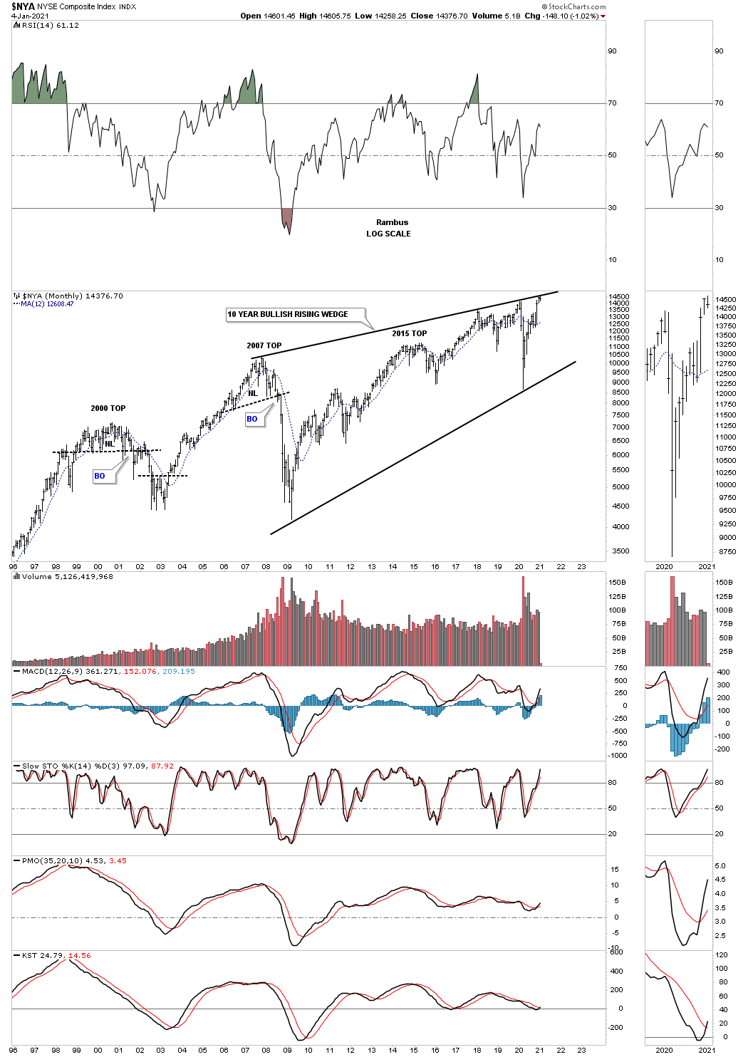
The NYA which is a broad measures of stocks is set up a bit differently than most of the other longer terms charts as it still hasn’t broken out of its massive 2007 bullish rising wedge.
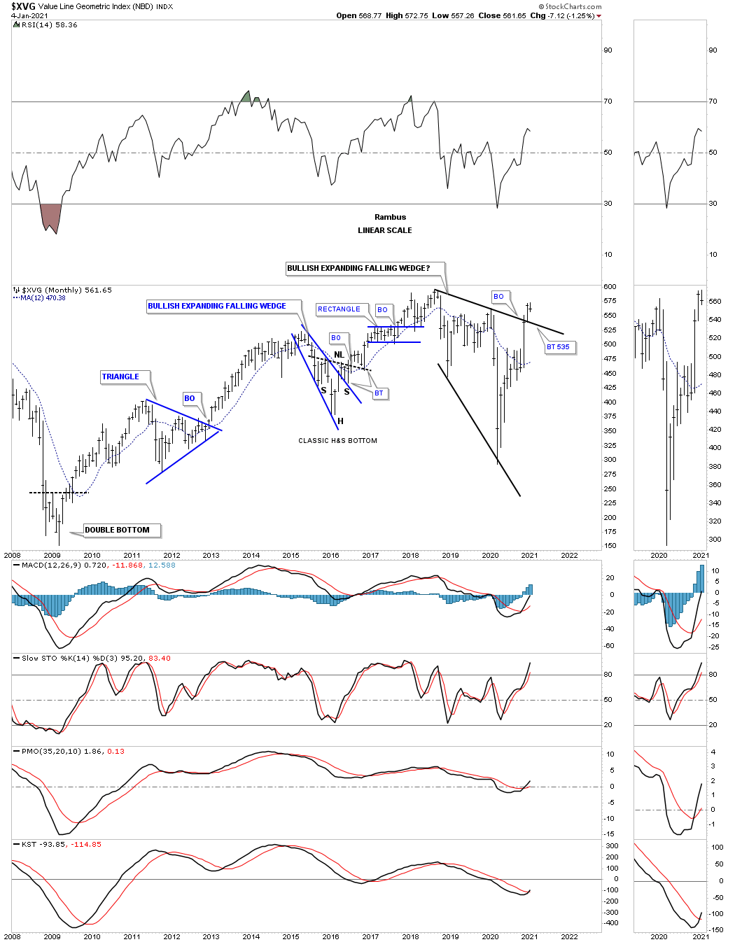
The XVG is lagging a bit but it is in the process of breaking out from its 2 year bullish expanding falling wedge which is generally a very bullish pattern.
This once in a lifetime bullish situation we currently find ourselves in is not just unique for the US but it will be a world wide event with many countries having their own bull markets.
Note where the 2020 crash found support.
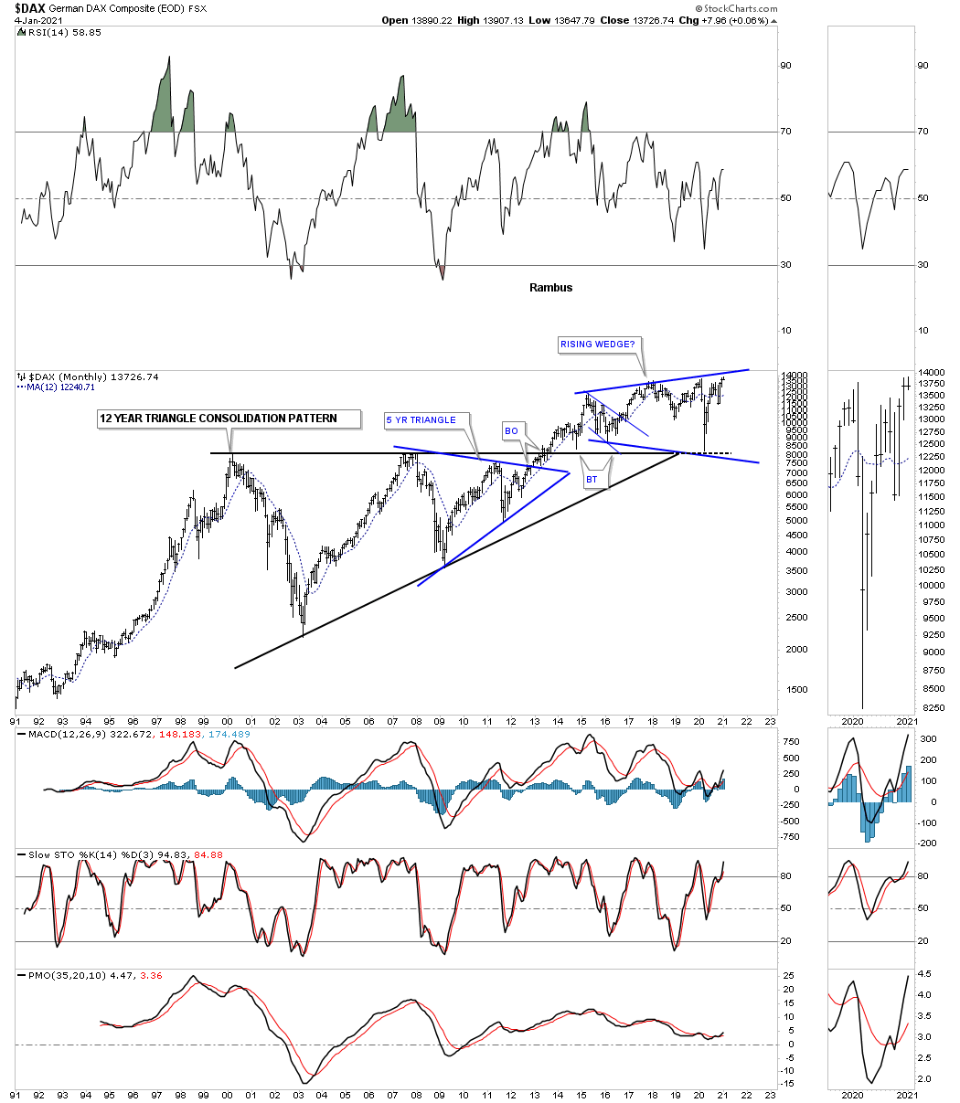
DAX is getting close to breaking out but is still in consolidation mode.
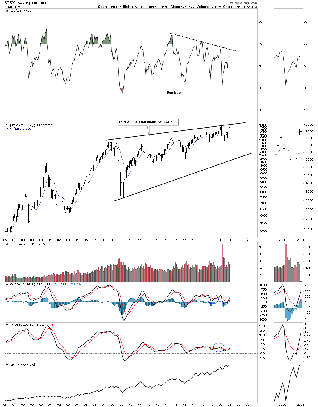
The TSX is approaching the top rail of its 12 year bullish rising wedge?
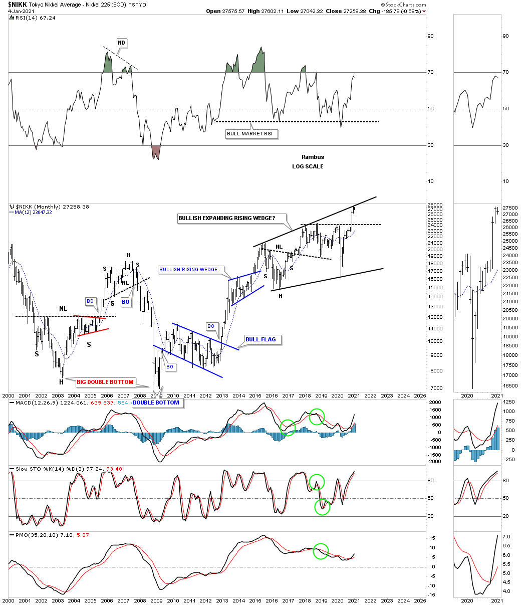
The NIKK is testing the top rail of its 2015 bullish expanding rising wedge.
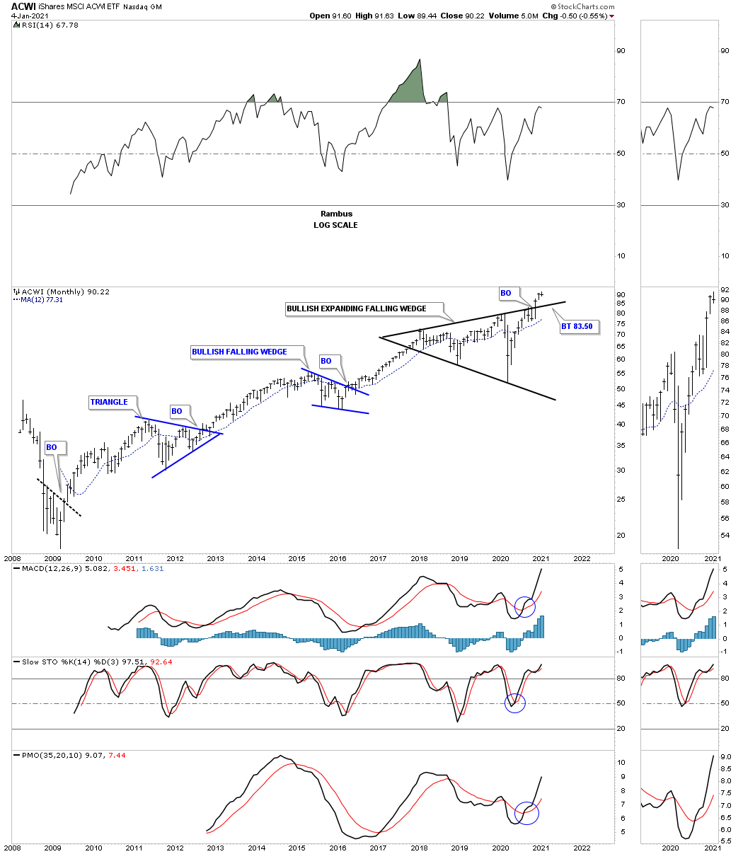
The ACWI world stock markets ex the US has just broken out from its bullish expanding triangle.
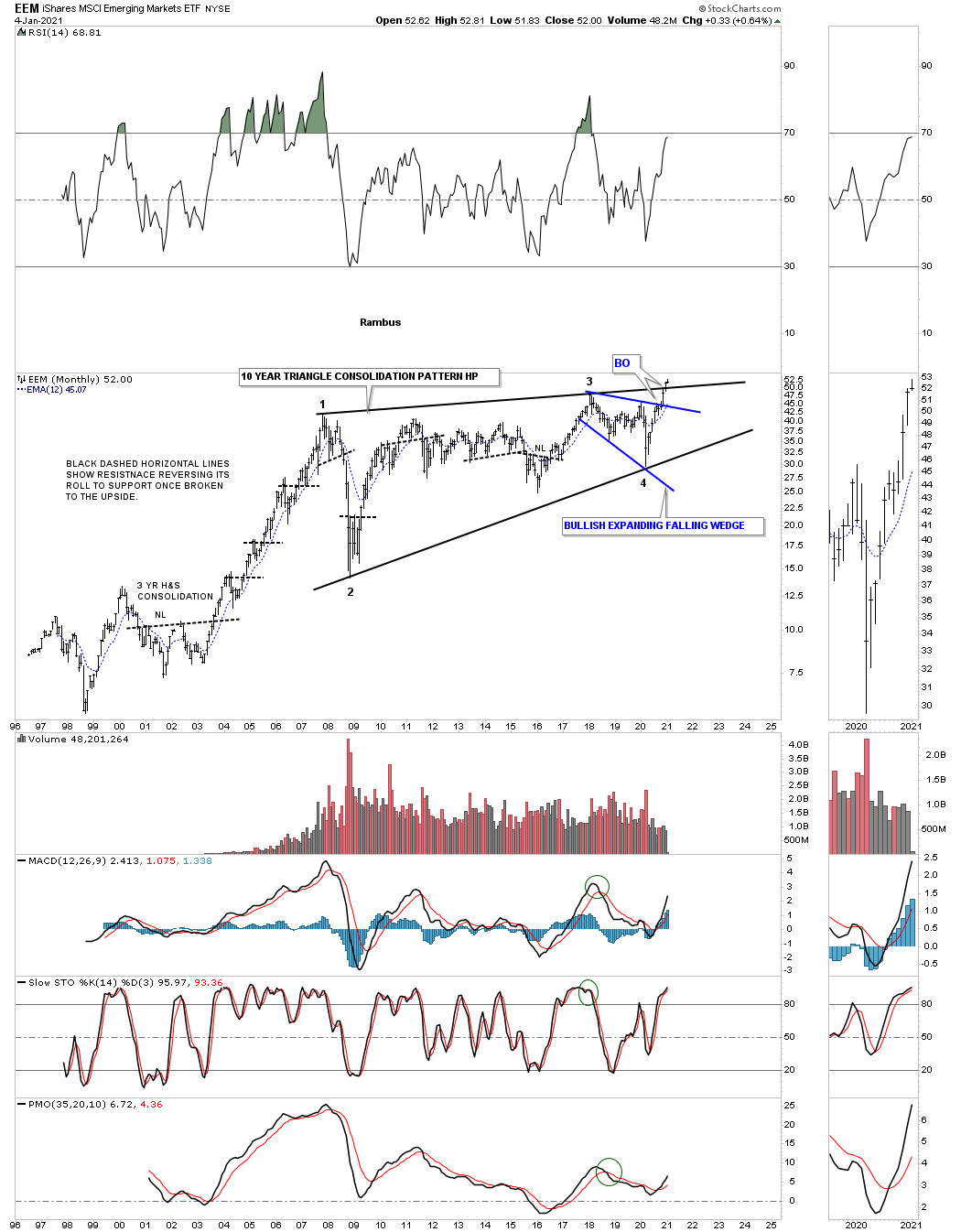
We have the EEM emerging markets ETF with the blue bullish expanding falling wedge forming just below the top rail of a 10 year bullish rising wedge attempting to breakout.
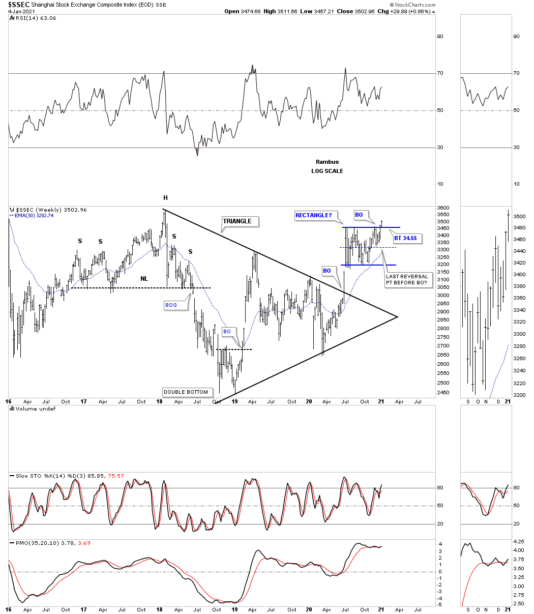
This weekly chart shows the SSEC breaking out from its rectangle consolidation pattern this week.
The blue bullish expanding falling wedge has given the FEZ euro STOXX 50 etf, the energy to breakout from its much bigger bullish expanding falling wedge.

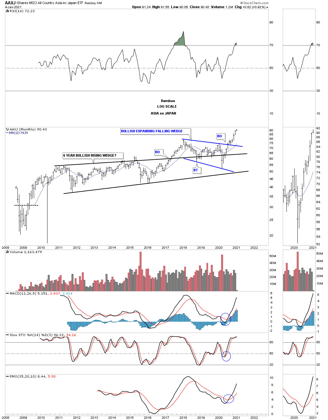
This last chart is the long term monthly chart for the AAXJ Asian stock markets ex Japan etf which should leave no doubt in your mind what is happening on the other side of the world. All the best…Rambus
Commodity Indexes
Normally during the end of a big move in a stock for instance, there will be a capitulation move where the price action can go parabolic that ends the move which can be on a short term scale or a very long term scale which is relative to the time scale you are looking at. These types of move can signal a new bull or bear market as well. Again, it all depends on what time scale you are looking at.
Tonight we’ll look at some long term commodity charts to see if they can give us any information regarding the inflation or deflation debate that seems to be on a lot of investors minds right now especially with all the stimulus being pumped into the economy. Being able to spot a major trend change early on can help us get on the right side and hopefully take full advantage of what of the situation presents to us.
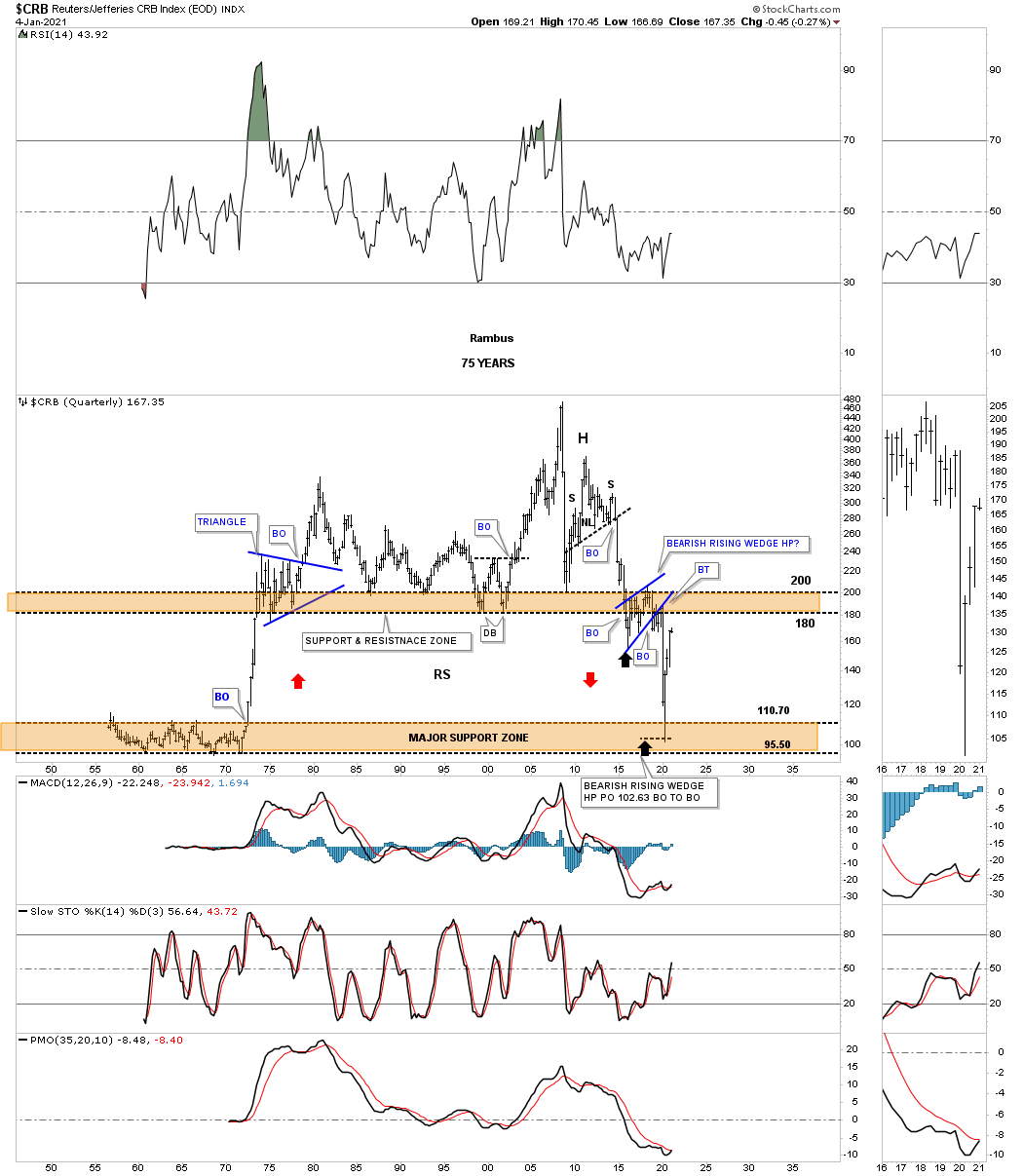
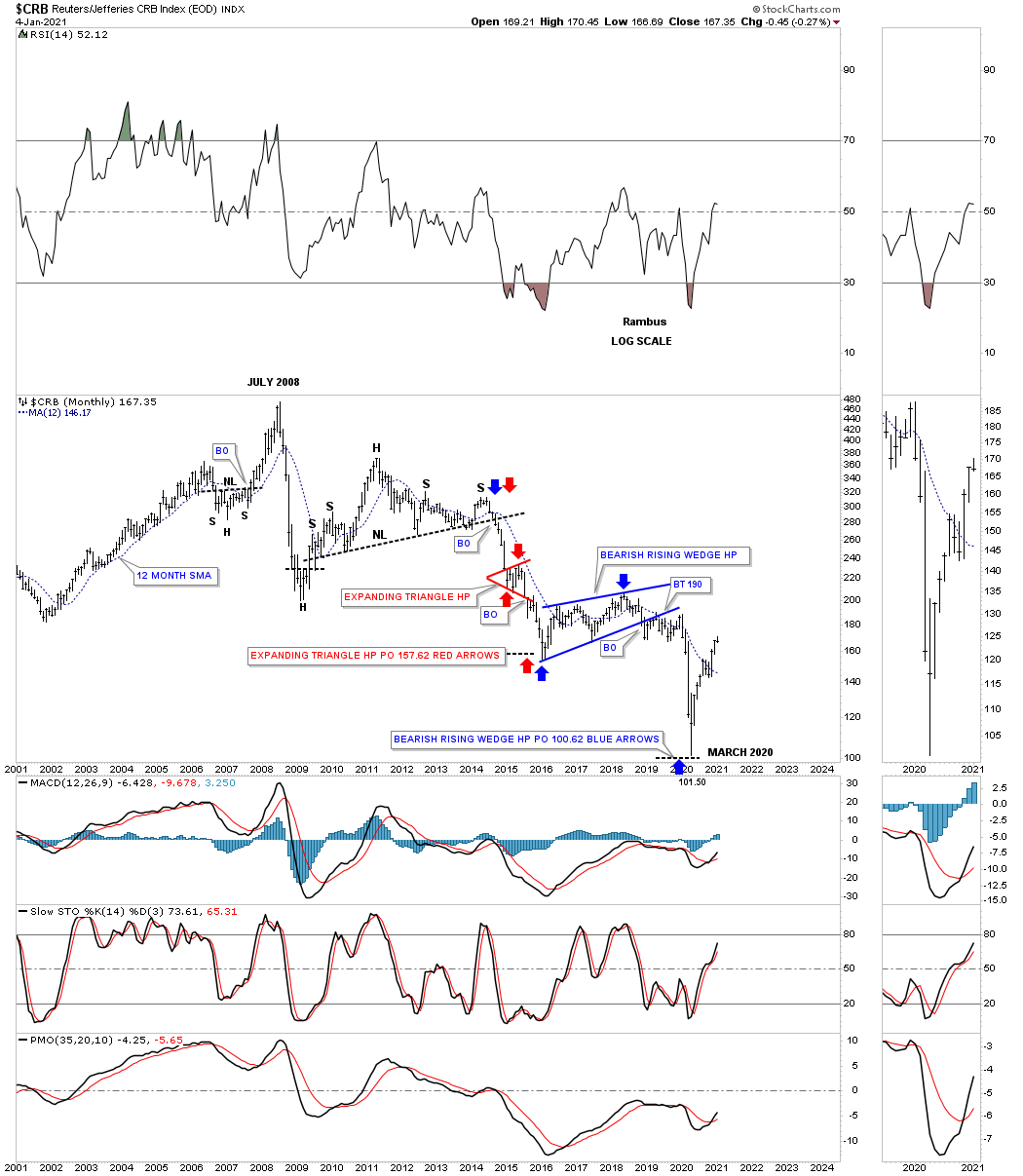
I have a ton of charts to show you tonight so lets get right to it keeping in mind what we discussed above about a possible capitulation move. Instead of starting out with the short term charts and working our way out to the longer charts I’m going to start with the quarterly chart for the CRB index first. Keep in mind most of the long term quarterly charts you will see tonight were originally built in 2014 in anticipation of that particular deflationary event.
What led us to believe that some type of deflationary event might come our way is when that 5 year H&S top completed in October of 2014. At the time of that impulse move down we were looking for the upper brown shaded S&R zone to hold support which it did after a strong test. As you can see the price action then backtested the S&R zone from below and formed the blue bearish rising wedge halfway pattern to the downside. This is the exact same original chart I built back then where I also showed how the CRB index could reverse symmetry to the downside over the same area on the upside in the 1970’s, red arrows. I was probably the only person on the planet that thought the CRB index could fall that low and the way it got to that low. Only possible through Chartology.
The blue bearish rising wedge halfway pattern had a price objective down to the 102 area based on the breakout to breakout method. The breakout to breakout method measures from the breakout of the H&S neckline to the first reversal point in the blue bearish rising wedge, black arrow. You take that distance and add it to the breakout point on the bearish rising wedge to get your price objective at 102. If a stock or in this case the CRB index ever had a look of capitulation this 75 year quarterly chart definitely does.
This next chart for the CRB index is a 20 year monthly chart which shows how the different price objectives were hit as shown by the colored arrows.
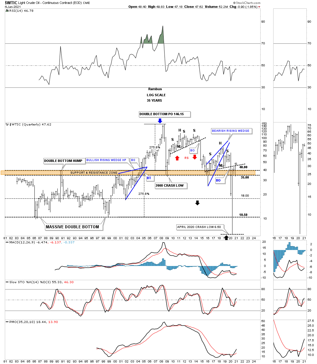
Next is the long term quarterly chart for WTIC that goes all the way back to its inception in the early 1980’s. Just like the CRB index the WTIC also built out a large H&S top which led to its crash in the middle of 2014 to March of 2015. Also like the CRB index we were looking for initial support to come into play at the brown shaded S&R zone which happened. The WTIC also built out the blue bearish rising wedge which then morphed into a classic H&S top with the left shoulder and head forming inside of the rising wedge while the right shoulder high formed on the backtest to the bottom rail of the blue rising wedge.
Note the blue bullish rising wedge that formed in the early 2000’s which gave oil the energy it needed to take out that 20 year brown shaded S&R zone. Also the width of that massive double bottom had a price objective up to the 146 area which ended that parabolic rise which also ended the bull market that began in 1998. I can honestly say that I have never seen a quarterly bar like the April quarterly bar on any chart I’ve ever built. I will be very curious to see what this chart will look like in the next 2 to 5 years.
Next is a 45 year quarterly chart for Copper which has held up better than the CRB and WTIC through the years. Just like the CRB and WTIC which built a massive base so to did Copper. The base Copper built began forming in the late 1970’s and finished in 2005 which formed a massive flat top expanding triangle. Copper also formed the blue bullish rising wedge just below the top rail of its massive flat top expanding triangle which gave it the energy it needed to breakout above resistance and rally up to its price objective at 3.81.
Moving over to the right hand side of the chart Copper could very well be building a possible blue bullish expanding falling wedge that was completed last quarter. Copper could also be building a double bottom as well. Also unlike the 2008 crash which backtested the top rail of that massive flat top expanding triangle this latest decline has held up very well failing to make a lower low on this time scale.
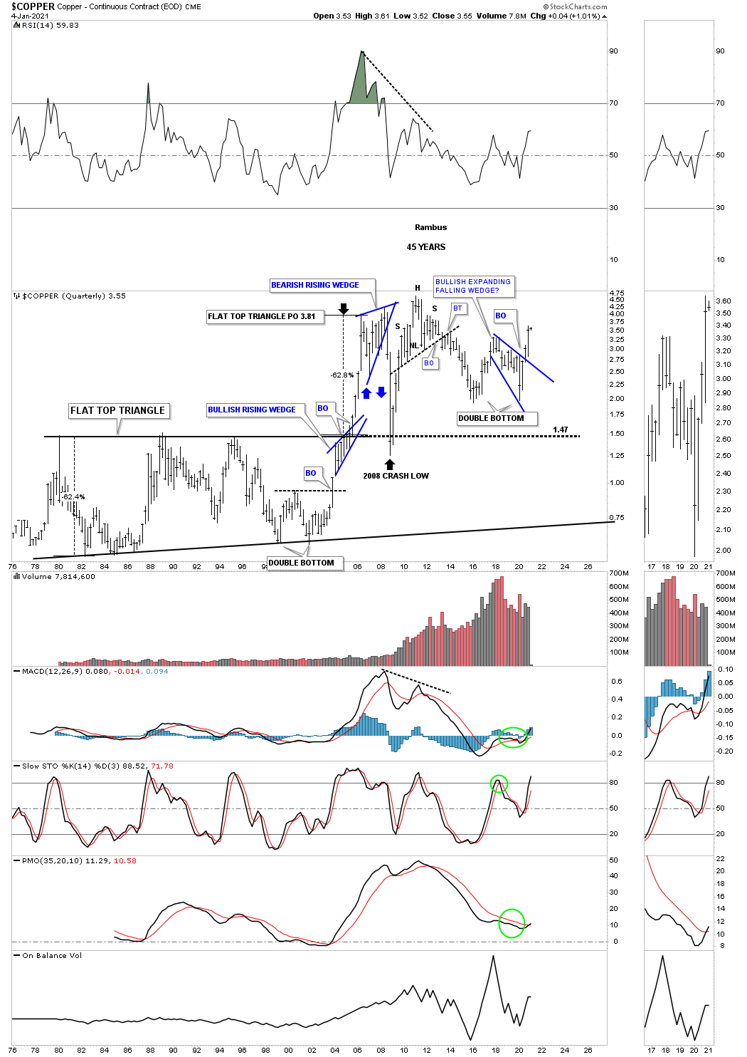
This next chart for Copper is a 25 year monthly chart which gives us another important perspective. Since the 2011 high Copper may very well be building a very large triangle consolidation pattern. The first thing we’ll want to see is for the price action to breakout above the top rail of the small blue expanding falling wedge. If that occurs then the top rail of the 2011 triangle will offer initial resistance which would most likely set up a ping pong move between the two trendlines.
Note the large double bottom which launched Copper on its bull market in 2000 that ended at the 2011 high. If you were to overlay one of the PM stock indexes, say the HUI on top of this Copper chart, these two would match up fairly closely as far as the major turning points are concerned.

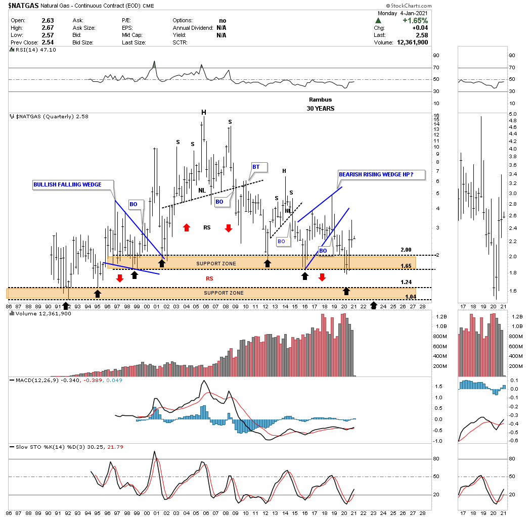
The last very long term quarterly chart I built back in 2014 was the NATGAS chart. You can see it has all the similar characteristics that the quarterly charts above are showing. If you stand back a bit and look at this chart from a distance the reverse symmetry on each side of the head is striking IMHO. Just like the other commodities we looked at tonight NATGAS also found initial support on the upper brown shaded S&R zone. The price action is currently trading back up to the previous quarterly high. A move higher will set into motion a higher high which is the first step in an uptrend.
In this in-depth report on commodities we’ll look at many individual areas to see what their long term charts look like. In order to find long term truning points, bottoms in a bear market or tops in a bull market, the only way that is possible is to look at the big picture. Keep in mind when looking at these long term charts that the process of reversing from a bear market in commodities to a bull market is going to be gradual in the beginning. It will be debated for several years before the realization that inflation is actually taking hold and there will be no more denying the facts. The next debate will be, how high will the inflation rate go? I think the Chartology will keep us one step ahead of the crowd.
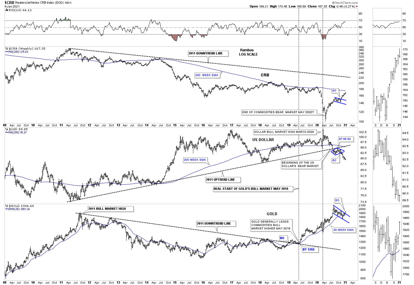
Most investors have their own way to determine whether we are in an inflationary or deflationary environment. For me personally I like to use a ratio combo chart which has the TIP:TLT ratio in black on top overlaid on the TLT in red with the CRB and the GDX below. Below is a long term weekly chart that goes back to the 2011 high when many commodities and the PM complex topped out. As you can see the ratio in black has been in a steady decline for close to 10 years now along with the CRB and the GDX.
Why do I think we are at the very beginning of a possible inflationary environment? The first little clue will be if we see the possible small red triple top complete and breakdown on the TLT which would coincide with the small reversal pattern on the black ratio to begin a strong rally to the upside. Now look to the bottom of this combo chart where the CRB and GDX are located. Note how the CRB, TLT and the TIP:TLT began reversing up 2 months ago in March, black dashed vertical line.
It is generally understood that the precious metals complex usually leads the rest of the commodities higher at important bottoms. Now lets look at the GDX on the very bottom where you can see this happening in real time as it has already broken out above its 2016 overhead horizontal resistance line while the CRB index is now breaking above its 2016 resistance line and it 30 week ema. So if the PM complex is leading commodities higher then they should follow the PM complex higher which should eventually lead to some degree of inflation down the road.

To really get a feel for how the new inflationary environment is in its early stages is by looking at the triple combo chart which has the CRB index on top with the US dollar in the middle and gold on the bottom. Looking at the US dollar in the middle you can see a classic breakout below the bottom rail of its 2011 uptrend line and then formed the blue diamond as its backtest. While the US dollar was in backtest mode the CRB index broke out from is small blue bull flag while Gold was forming its own bull flag breaking out today. At this point these three sectors are moving in the right direction and are suggesting we may see some inflation in our future.
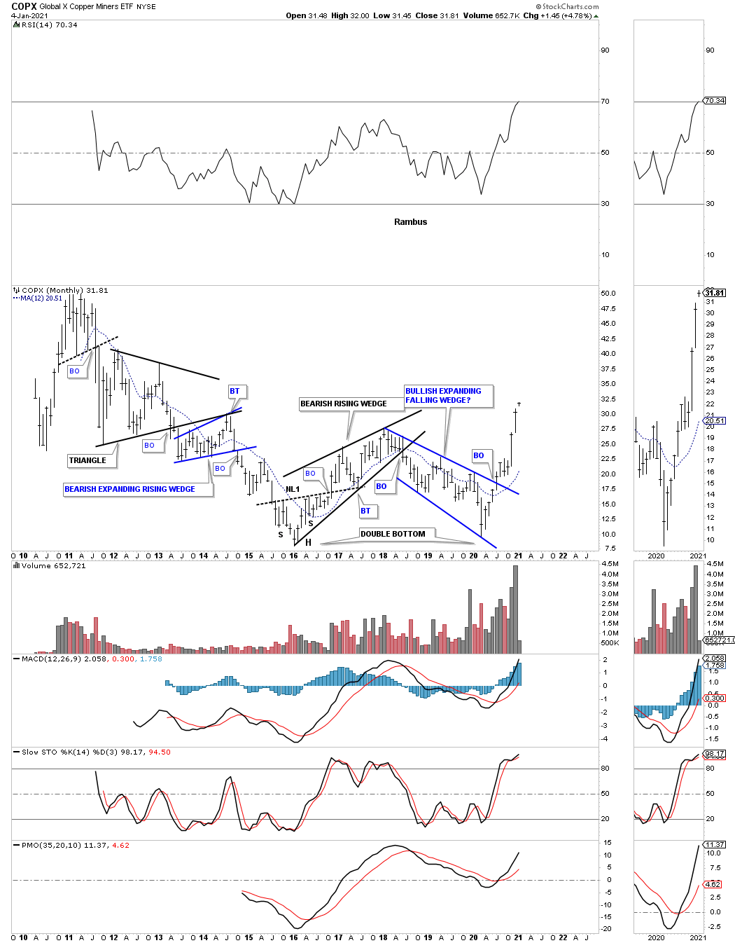
Now lets look at some individual commodities to see what they may be suggesting as far as an important turning point.This long term monthly chart for the COPX, Copper miners etf, has broken out from a bullish expanding falling wedge which could be part of a possible double bottom going back to the low in 2016.
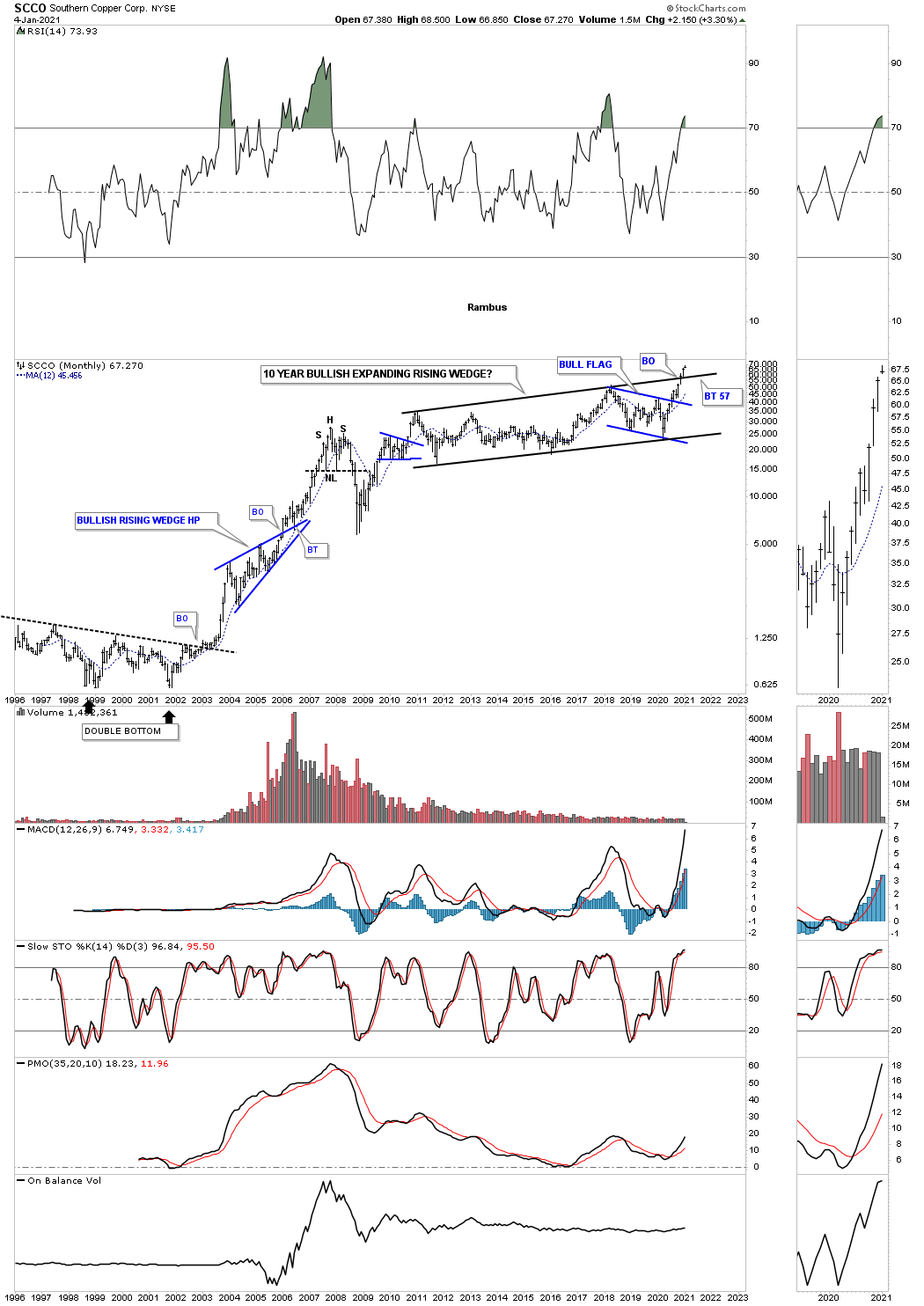
SCCO, Southern Copper, has been building out a 10 year expanding rising wedge. A breakout of the blue flag will ensure a move to the top black rail which could then lead to a major breakout and much higher prices.
Lets look at a few steel stocks as they have been consolidating for a long time. First is NUE which just finished putting in its 3rd reversal point after breaking down from the H&S top and reaching its measured move at 31.40.

SCHN is another steel stock that is forming a possible bullish expanding falling wedge as the right bottom of a possible double bottom reversal pattern. There is a dominate consolidation pattern in many of the different commodities which is the bullish expanding falling wedge. I’ve mentioned many times that these are the toughest patterns to spot in real time as the last low is usually extremely low which shakes out most investors. On the other hand if you do spot one of these patterns early enough they can be very rewarding.

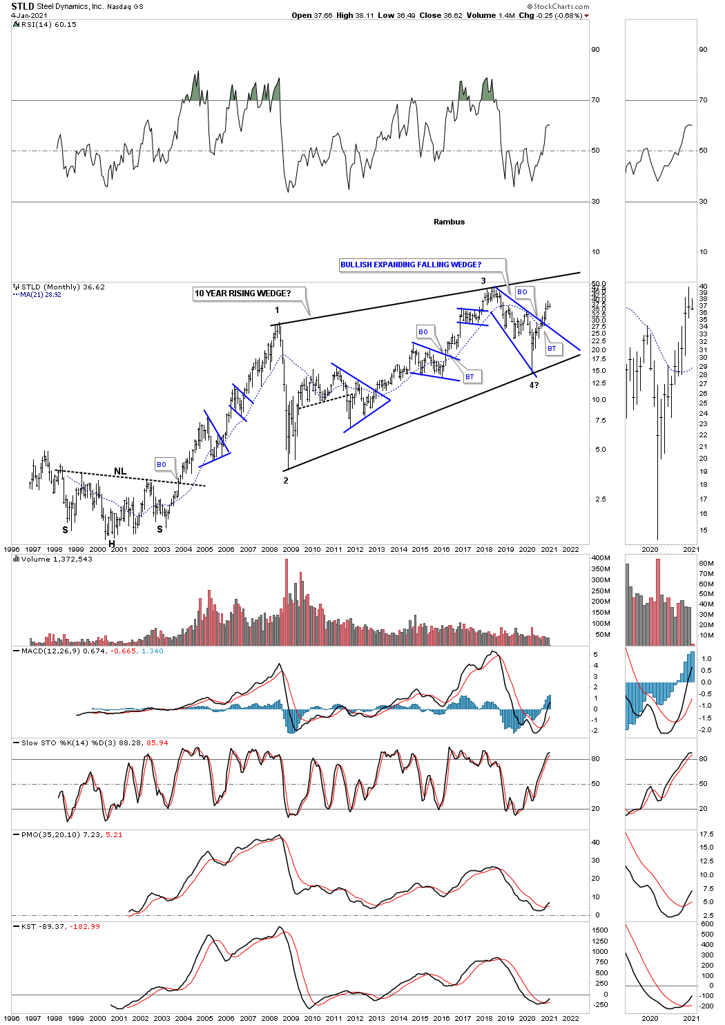
STLD is building out a potential very large bullish rising wedge that is 9 years in the making. The blue consolidation patterns show the internal structure of the 9 year rising wedge with the 3rd reversal point completing during the crash low in March of this year. A breakout of the top rail of the blue expanding falling wedge will be a very bullish development as it will suggest a move to the top rail of the black rising wedge and will complete the all important 4th reversal point.
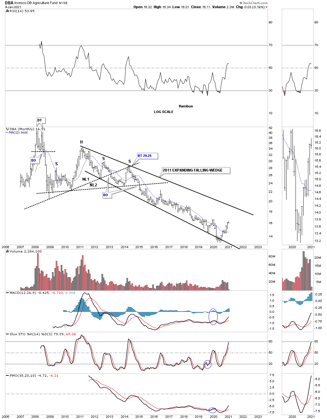
The DBA, agricultural fund, has been trending down since 2011 which puts it right up there with natural gas as the weakest areas in the commodities complex.
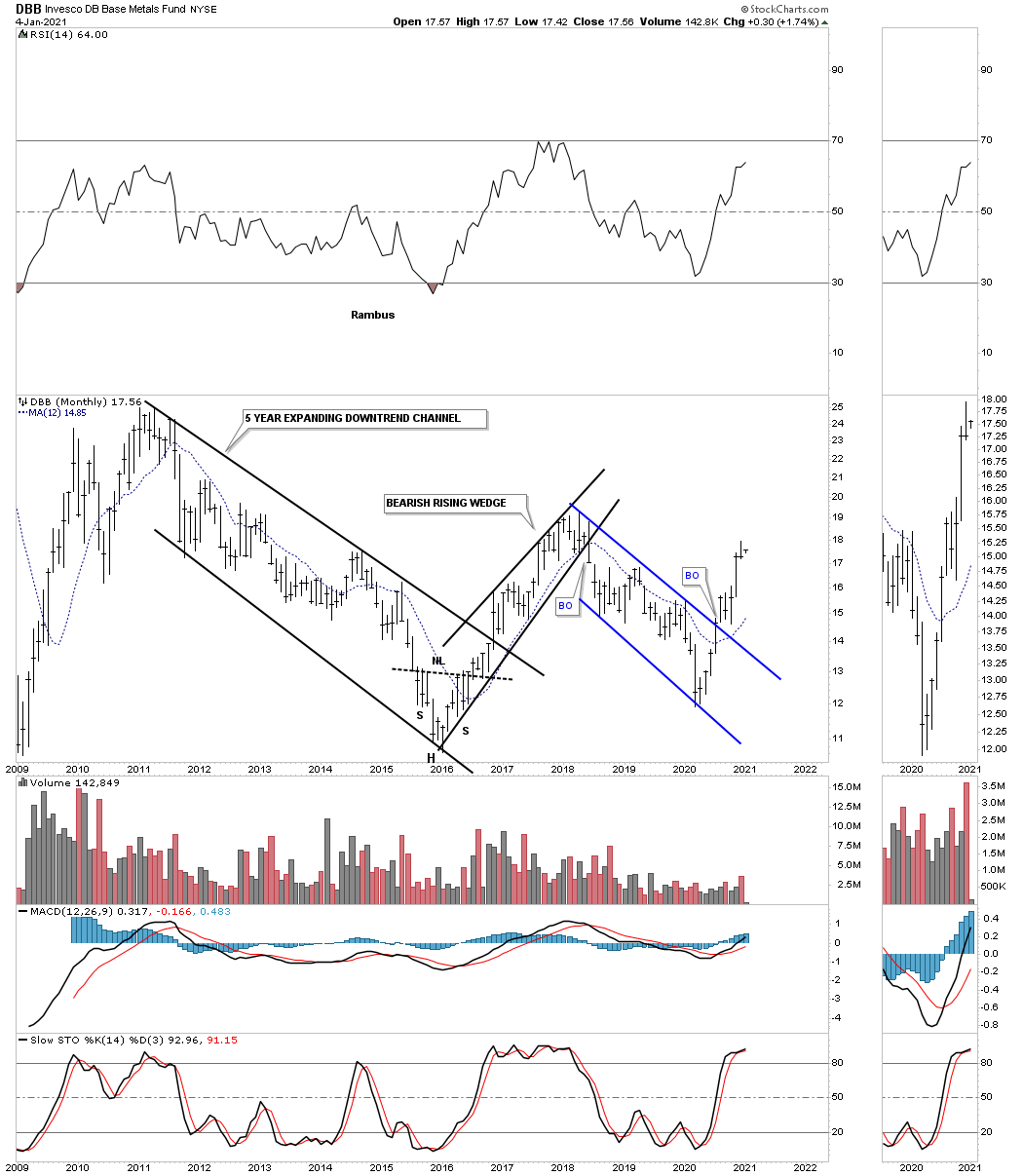
The DBB, base metals fund, has been trending lower since 2018 forming a possible bullish expanding falling wedge.
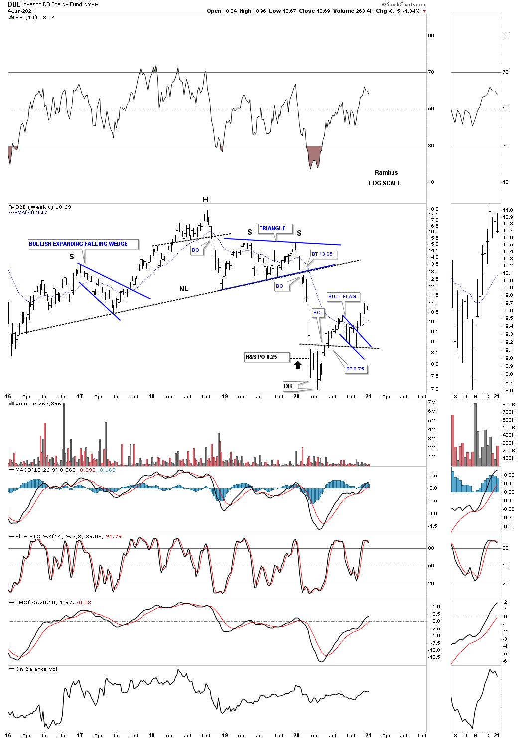
The DBE, energy fund, looks to be completing a small double bottom after reaching its H&S price objective at 8.25.
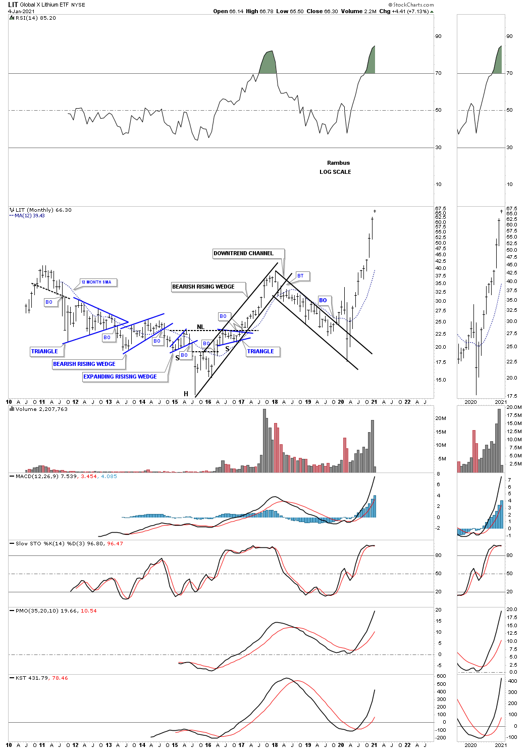
LIT, Lithium etf, has been in a strong rally after the crash low in March of this year. This area is one of the strongest sectors in the commodity complex as it is making a new all time high.
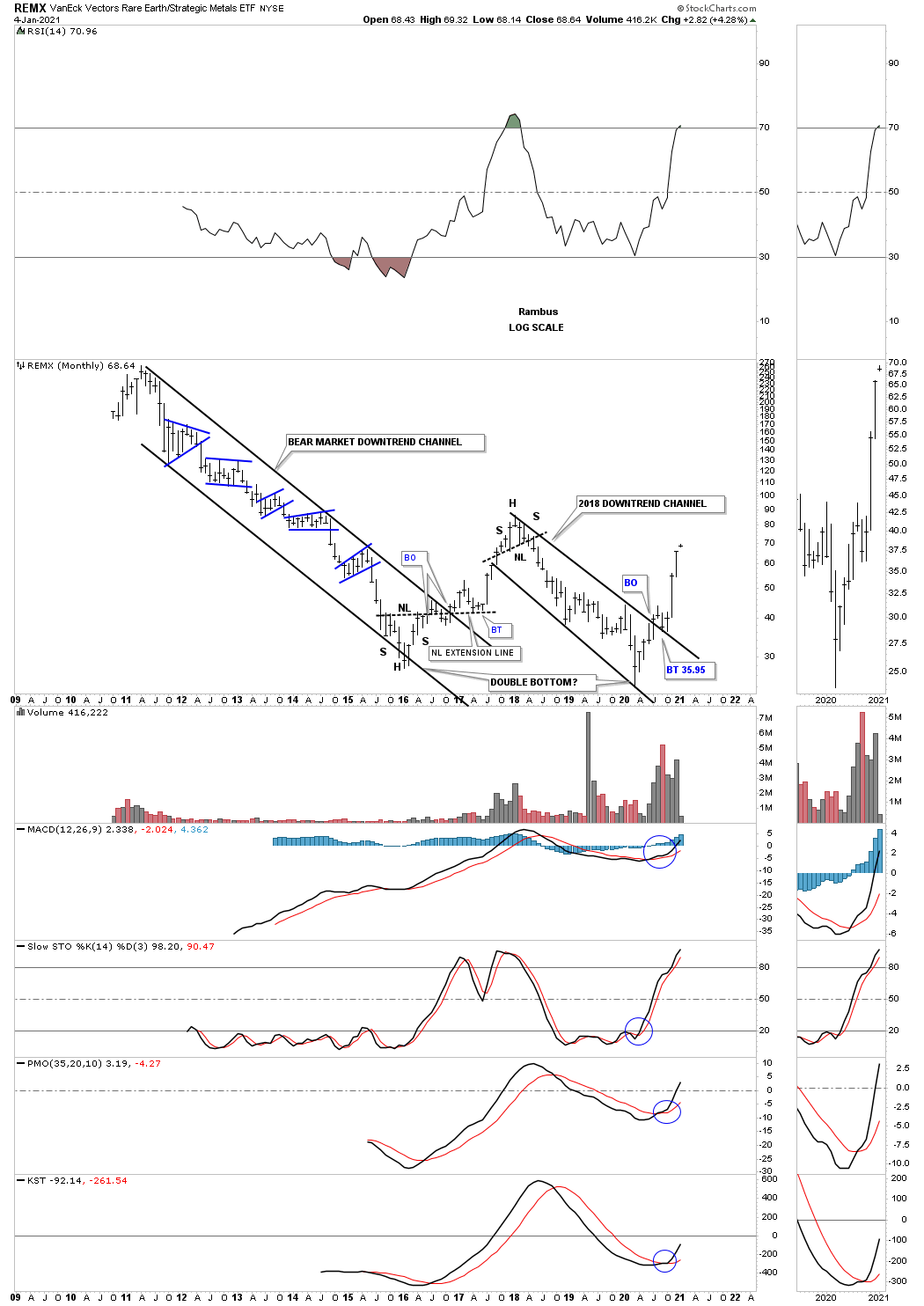
REMX, rare earth etf, has been a dog for most of its existence with only one countertrend rally. The price action has recently broken out from its 2018 downtrend channel with a backtest in place.
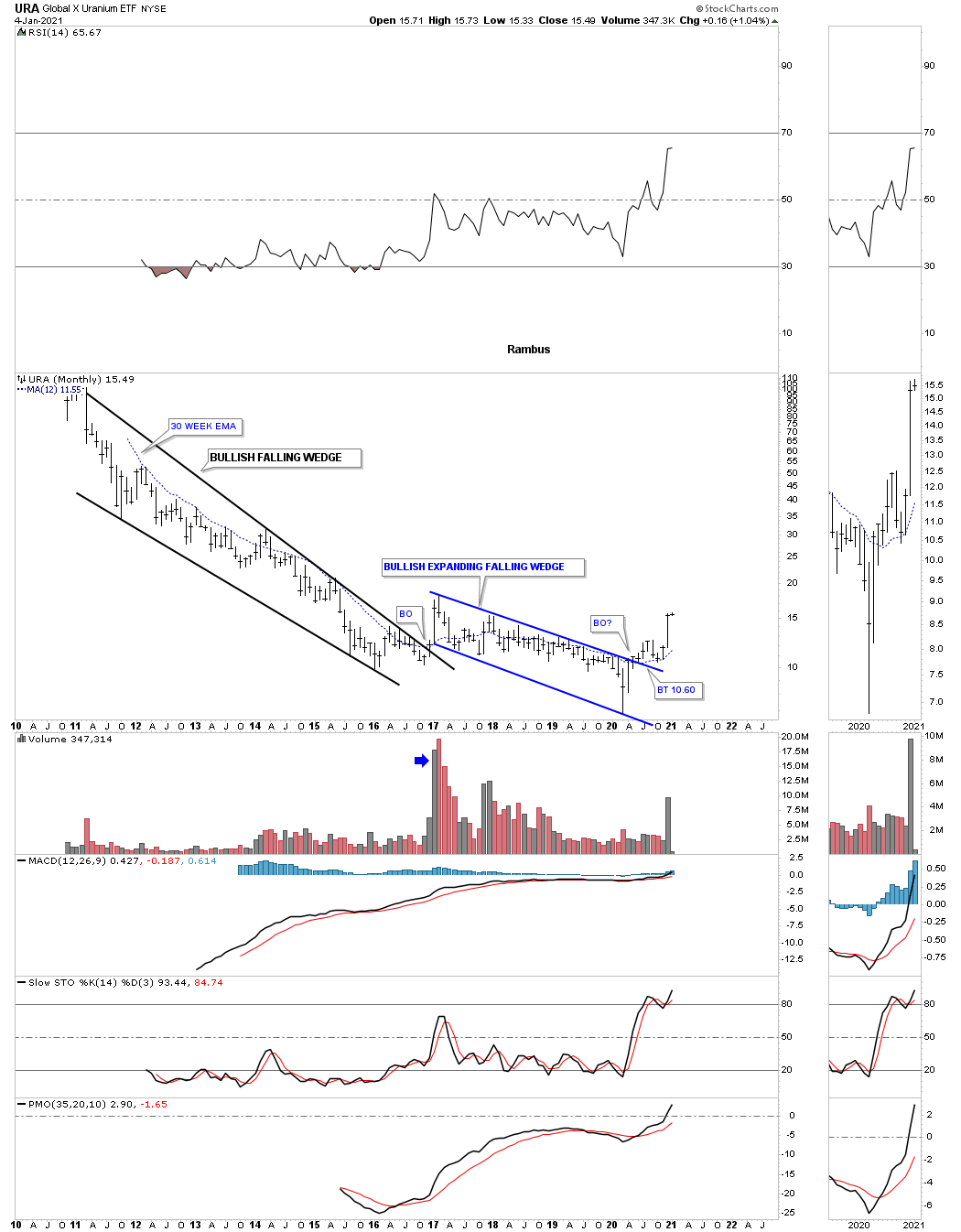
URA, Uranium etf, had been very weak for most of its existence but could be showing a little life if it can hold the potential breakout above the expanding falling wedge on the backtest that is currently underway.
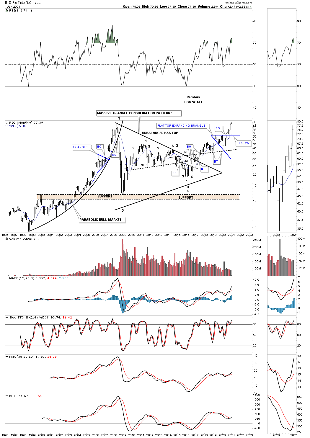
RIO is a very large mining company which formed a massive 10 year triangle with the breakout taking place in December of 216 and has been in a bull market ever since. It found support for the 2nd time on the backtest to the neckline symmetry line taken from the 2016 H&S bottom. The price action is now trading in its 5th month above the flat top expanding triangle.
The XLB, basic materials fund, sold off hard during the March crash but has rallied back up to close at new all time highs. Like several stocks we’ve looked at today the XLB has also formed a flat top expanding triangle which could be a very bullish pattern if we get the breakout above the top rail that will coincide with the other flat top expanding triangles we looked at. There are a lot of stocks in the XLB that are also in the INDU so these 2 can move somewhat together.

This last chart for this commodities report is the XME, metals and mining fund. This monthly chart shows the entire history of the XME and how it has traded in the confines of the falling wedge. It to is building out a possible bullish expanding falling wedge like many other stocks we’ve looked at today. You may also recall there were many bullish expanding falling wedges that were made on many of the PM stocks as well.
If we are seeing the actual bottom in the commodities complex there will not be a bell that rings to let everybody know. The environment at an important low is generally pretty muted with most investors not even remotely aware of what is taking place as their main focus is in other areas. All the best…Rambus

An In-Depth Look At Gold
Gold plays a duel role as a commodity and as a monetary metal which makes it important to keep a close eye on. During the early stages of a commodity bull market Gold will generally lead the whole complex higher. When the troops see the General leading they will feel more emboldened to have their turn at a bull market. We’ve seen this scenario playing out since the Spring of this year where most of the important commodities have bottomed out and are beginning their new respective bull markets. Gold actually bottomed in late December of 2015 while commodities continued in their bear markets into the Spring of 2020.
As a monetary metal some investors like to use Gold as a safe way to store wealth or as a hedge against inflation. Other investors like to have Gold in their portfolio in case the stock markets crash and the economy goes into a deep tailspin and never recovers again. One thing we do know is that Gold will always have a monetary value and not go to zero which is possible with an individual stock.
In this in-depth look at Gold we’ll look at it from the daily to quarterly charts, in bar and line charts and ratio combo charts which will paint the history for gold starting from the 1970’s to the present. When you finish reading this post you should have a strong understanding of where Gold has been and where it is likely to go based on the Chartology. There are no absolutes when it comes to the markets, but as we know history never repeats exactly the same but can rhyme to a certain degree.
Let’s start with a daily chart for Gold and then work our way out to the longer term charts and try to put all the pieces of the puzzle together to form a working scenario we can use to help guide us going forward. Without a game plan or working scenario one is left to the emotional destruction, from a psychological perspective, that ruins most investors that don’t have a true understanding of how markets work.
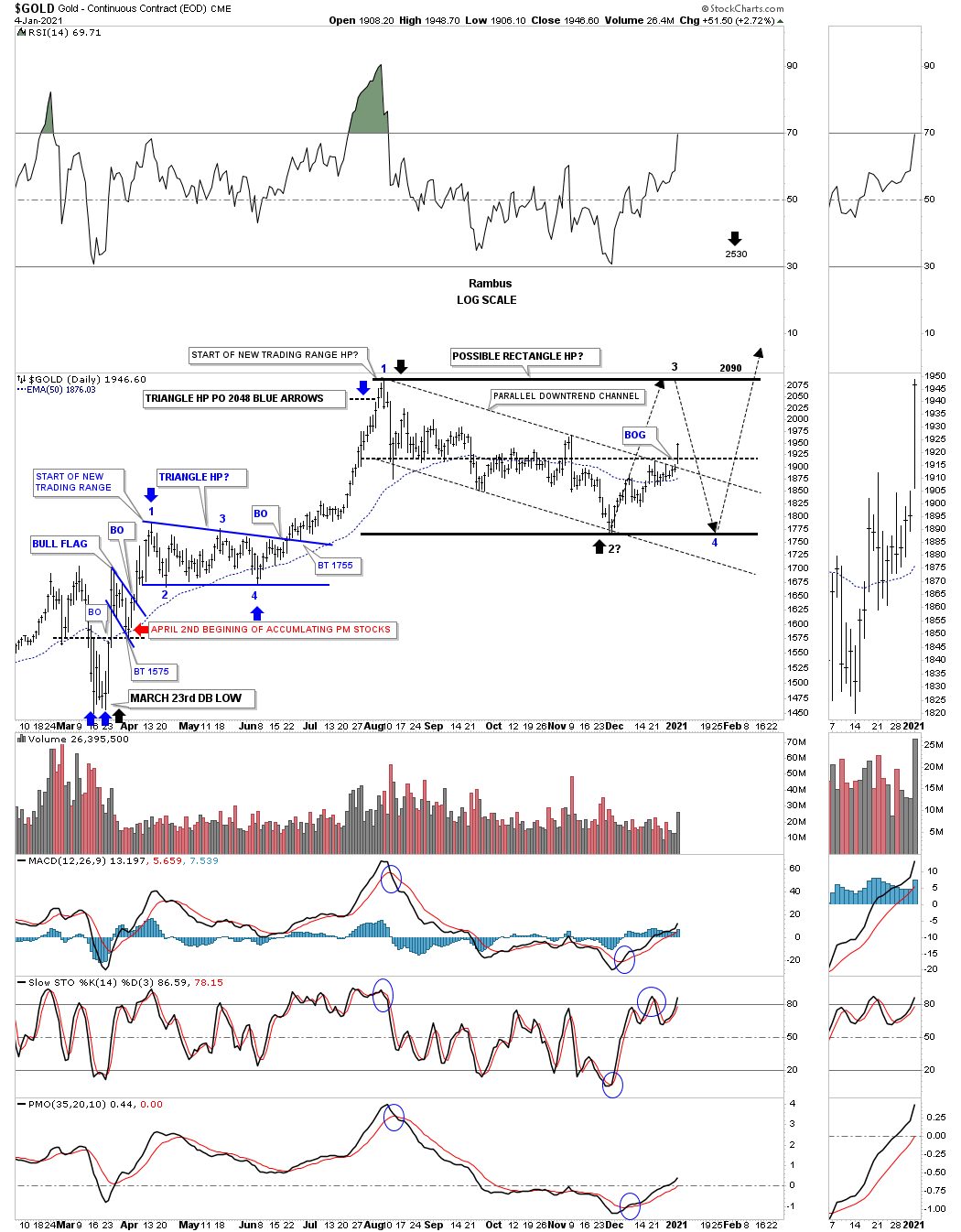
This first daily chart for Gold begins with the 2020 crash low that occurred on March 23rd of this year. In order to end a downtrend there is generally some type of reversal pattern that may seem obscured initially but may stick out like a sore thumb after some time has lapsed. Gold formed a small double bottom at the March 23rd low which reversed that hard move down. Once Gold traded above the double bottom trendline that was the first sign that Gold may be getting ready for a move to the upside. On April 2nd Gold backtested the double bottom trendline from above which put the new bottom in play as long as the backtest held support. As you can see Gold built that small blue bull flag as the backtest which worked like a halfway pattern. After the breakout from the top rail of the blue flag Gold impulsed higher until it ran out of gas and needed to consolidate its gains by forming the blue triangle halfway pattern which was truly a halfway pattern as shown by the blue arrows.
After completing the blue 2 month triangle HP the second impulse move of the new bull market reached it price objective up around the 2090 area where it was time to consolidate those gains starting at the August 7th high. From that August 7th high to the present, investors with no game plan or a way to visualize the price action either from an Elliot Wave, Cycles or in our case Chartology, are left totally in the dark with only their emotions to guide them. I know for some of our new members this is the first time you have ever understood what it means to live through a consolidation phase in real time which are meant to shake you off the bull.
There was no way to know what type of consolidation pattern would form off the August 7th high only that the odds were high that we would see some type of consolidation pattern build out in time and price. I’ve mentioned many times to you that there are easy consolidation patterns such as a triangle or a bullish rising wedge or rising flag which don’t have a lower low. Then there are harder consolidation patterns that can be much harder to deal with such as a bull flag which sounds easy but you have to hold on when the stock is making lower highs and lower lows which can be hard on your emotions. It’s a great consolidation pattern when it is finished but can be hell for many investors that don’t understand what is taking place.
For those that are new to Chartology you have just lived through one of the tougher consolidation patterns to deal with which is still not complete yet but getting closer. The reason the August bull flag is getting close to completing is because we are seeing a H&S bottom forming at the 4th reversal point. If the H&S bottom plays out it has a price objective up to the 1987 area which is way above the top rail of the August bull flag. Now we wait and see what the price action has to say about our bullish scenario.
One last point I would like to make before we move on. The potential August bull flag can either be a stand alone consolidation pattern, meaning this IS the consolidation pattern that will lead the next impulse move higher into new high territory. The other possibility that most PM investors don’t see is that the August bull flag could very well be part of a much bigger consolation pattern that we’ll explore later on.
January 4th 2021 Gold breaks out from parallel downtrend channel.
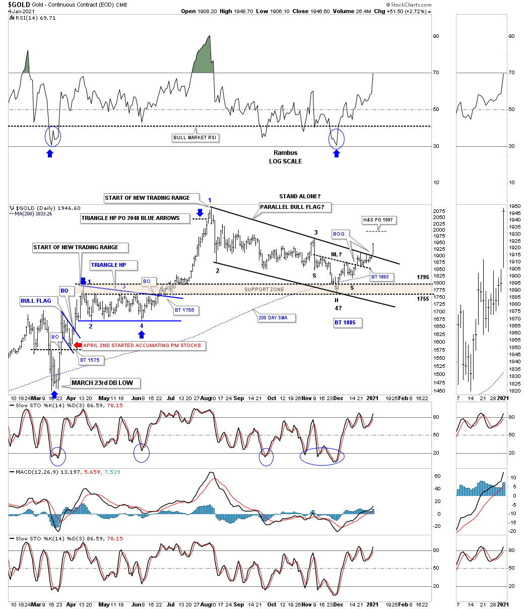
This next daily chart is exactly like the one above but shows how a possible bigger consolidation pattern may form which would be perfectly normal given the advance Gold has had since its longer term lows made back in 2018. I have been suggesting for some time now that I would not be surprised to see a bigger consolidation pattern form with the August flag being reversal points #1 and #2 with the current rally moving up to the previous all time highs and then at least one more decline toward the bottom of our current trading range. See the blue April – May triangle to get a sense of what is possible off the 2nd reversal point. If indeed the August high is the first reversal point in a much bigger trading range or consolidation pattern that we see now, would strongly suggest a very bullish setup with the black rectangle being a halfway pattern in its own right which would have a price objective up to the 2530 area as shown by the black arrows. Again we’ll look at this possibility on some longer term charts. The red arrows show the backtest to the double bottom trendline where we began to accumulate some of our PM stocks.
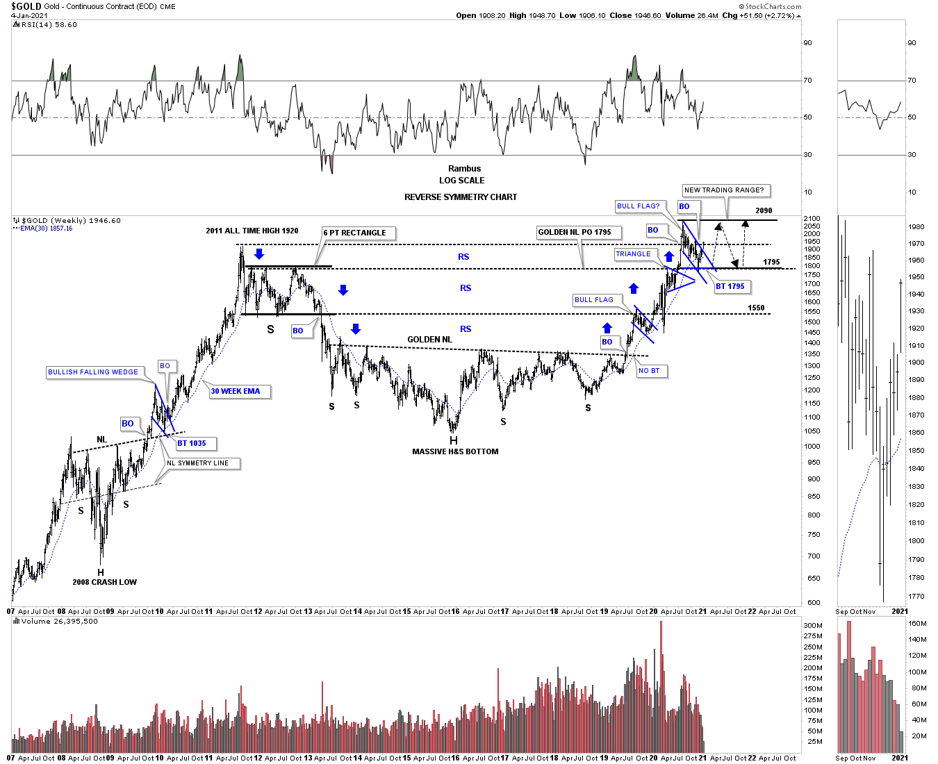
Now lets step back a little further in time and look at the very bullish setup Gold has been in ever since the breakout from that massive H&S base on this weekly reverse symmetry chart. It has been a picture perfect bull market since the breakout from the large H&S bottom with one consolidation pattern forming on top of the previous one. This is exactly what a bull market is supposed to look like. Now the issue becomes how big of a consolidation phase does gold need to build up enough energy to launch its next impulse move into new all time high ground? You can see how the bull flag we just looked at on the daily charts above fits into the bigger picture. Again, if the small blue flag is going to be a stand alone pattern then the next impulse move higher is already underway. The true test will come when the price action reaches the old high around the 2090 area. If Gold fails around that area then the much bigger trading range will come into focus which will not be the end of the world by any stretch of the imagination. A possible large trading range that gold is forming will offer us a golden opportunity to trade the reversal points which in a big pattern could lead to some big games.
Two things to note. First that massive H&S consolidation pattern had a price objective up to the 1795 area which was hit. The second thing is how the top rail of the 2012 rectangle consolidation pattern has done exactly what we were looking for which is support on a backtest from above.
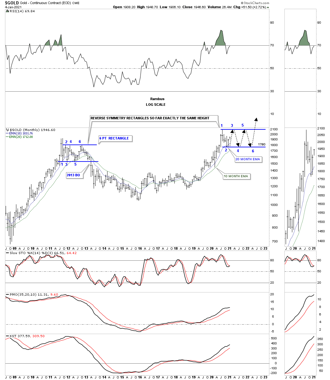
Most of you know I’m a big believer in Reverse Symmetry, how a stock goes down, especially in a hard and fast move, many times it will reverse back up over the same area. Note the 2012 rectangle which had 6 reversal points that drove most PM investors mad especially when the price action broke to the downside. Many at that time called it manipulation but we saw it for what it was, a 6 point consolidation pattern in a new bear market. Is reverse symmetry suggesting a possible clone to some degree of the 2012 rectangle?
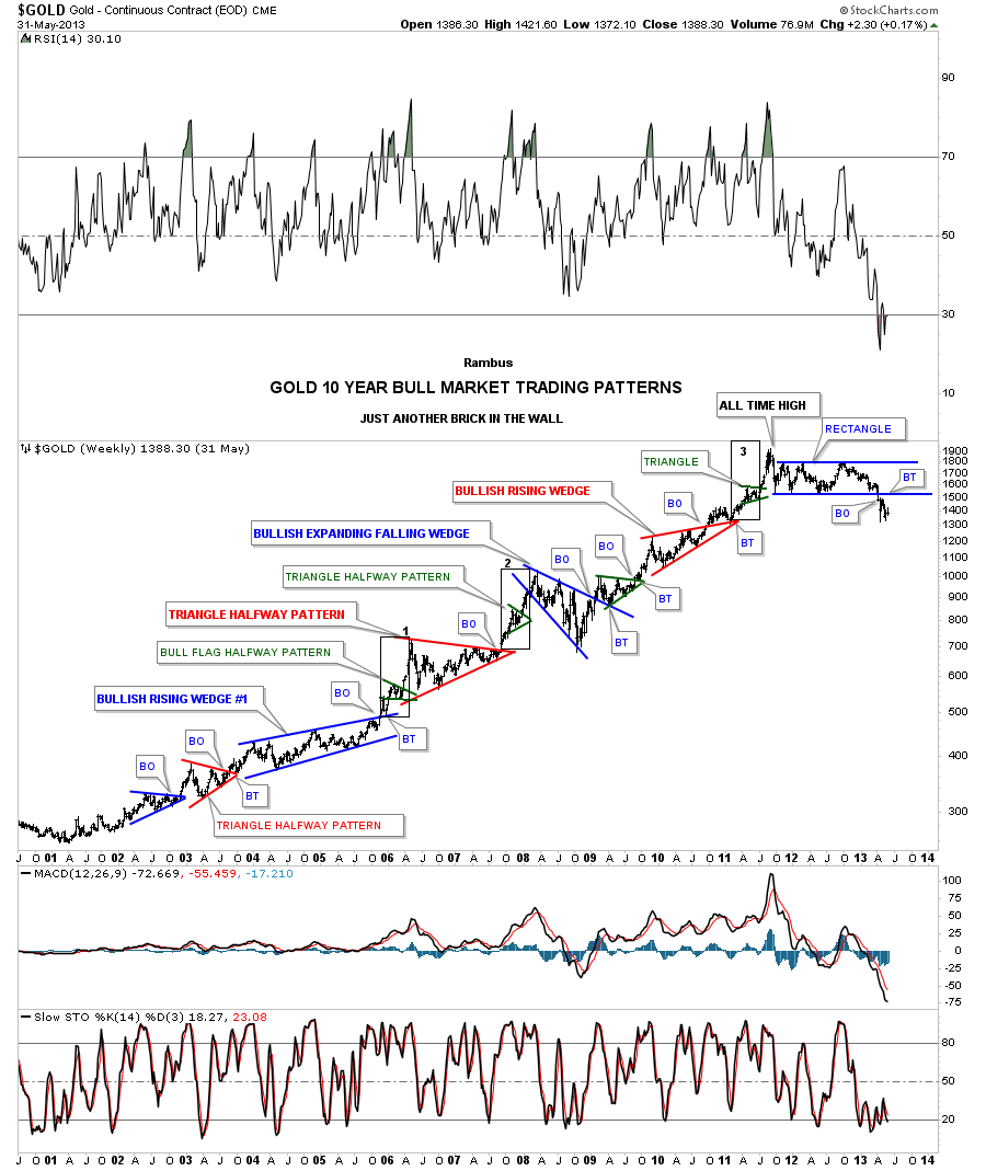
This next weekly chart is one I called, Just Another Brick in the Wall, during the bull market years. When I hear people talk about how gold is manipulated I have to let it go in one ear and out the other because you are not going to change their mind no matter how much evidence you show them. When I look at all the beautiful Chartology that Gold created during its bull market years I’m in awe. This chart shows you all the classic chart patterns a bull market like Gold can form. Manipulators can’t form chart patterns like these only millions of investors that see the price action for what it is.
Note the impulse move when each and every consolidation pattern completed its work. I’ve often showed you many examples of what a pattern, that slopes up in the direction of the major trend that tells you the trend is very strong. As you can see Gold produced 2 bullish rising wedges each with a perfect breakout and backtest. If you look closely at each impulse move up you will see a small green triangle that formed in the middle of that impulse move as as halfway pattern. The thin black rectangles are exactly the same height and measures 3 of the impulse move price objectives. The reason the blue rectangle that formed just below the all time high is a consolidation pattern is because it formed just below the all time high which needed an even number of reversal points. If we would have seen an odd number of reversal points then we would have seen a reversal pattern that would have taken out the high at 1920. You take what the market gives you to work with.
Whenever you look at a line chart it can often times takes out some of the noise a bar chart can make. Below is a 10 year weekly line chart for Gold which shows some interesting Chartology. First you can see the August correction in gold pulled back to the top of the 2012 rectangle where the price action is working on the possible bull flag that could end up being part of a bigger consolidation pattern. During the formation of the right shoulder of that massive H&S consolidation pattern you can see a smaller H&S pattern forming the last reversal point before the neckline was finally broken. Again we looked at a smaller H&S bottom forming at the last reversal point on the daily charts above which are strongly suggesting that the August trading range is going to give way.
There was an interesting development on the RSI when Gold was building out its right shoulder. Most of the time we look for a negative divergence which shows up when a stock is making a higher high while the RSI is making a lower high. This weekly chart shows a reverse divergence which is made when the RSI and gold both formed their initial low. As you can see the RSI went on to make a lower low but gold made a higher low. This chart also shows you how the RSI can work toward your favor if you know you are in a bull market. Most of the times the RSI will trade around RSI 40 or so during a normal correction.
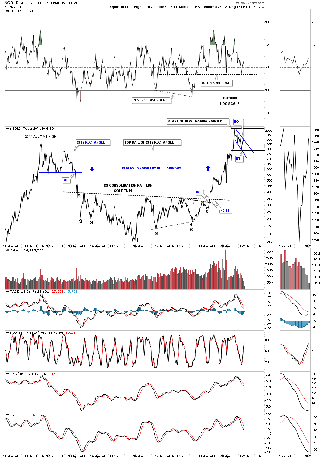
Let’s look at some monthly charts for Gold as they can often times give you a slightly better understanding of the Chartology. This first monthly chart shows you a great example of how resistance reverses its role to support once broken to the upside. The red arrows show you the top of each consolidation pattern during the bull market years. The black arrows show you how the top of each consolidation pattern held support when backtested from above. You are seeing one of the most basic rules from a Chartology perspective. You can see a similar setup in regards to the massive H&S bottom where the red arrows show you the neckline. Once the neckline was broken to the upside the black arrows shows how gold attempted to backtest the neckline looking for support which came up a bit short of a complete backtest but the basic principle is there.
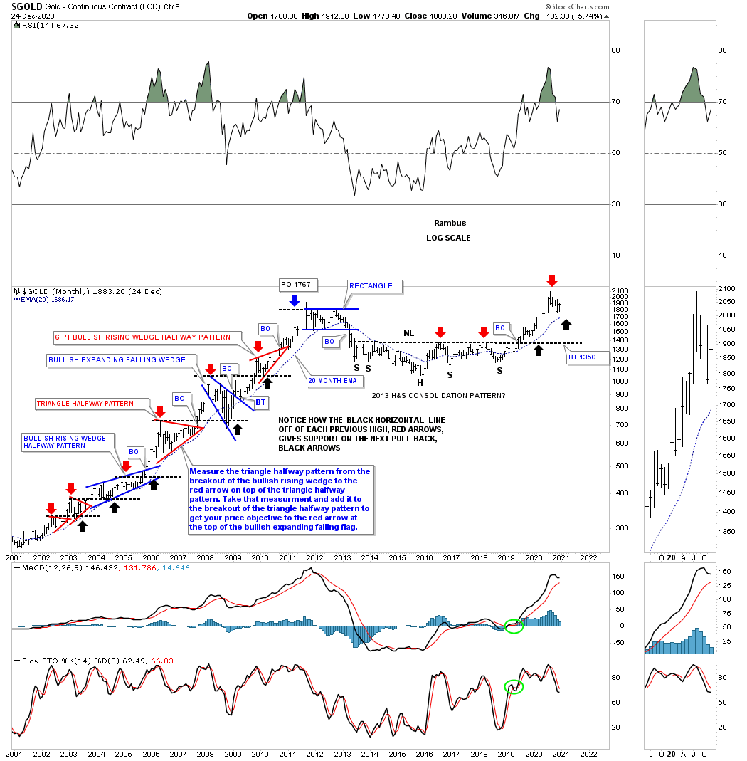
This next long term chart for gold is just a simple monthly look at just the bigger consolidation patterns and how the 10 and 20 month ema work as support during the bull market years. During the bull market years the only time the 10 and 20 month ema’s were broken was during the 2008 crash and again just before the blue rectangle gave way in 2013 which really launched the bear market. The last 2 months of trading shows how the blue 10 month ema has been holding support. Back in March of this year the red 20 month ema did its job of holding support.
Next lets look at the very symmetrical H&S consolidation pattern that formed at the 2008 crash low. It is very symmetrical as shown by the neckline symmetry line which is taken from the neckline and added to the left shoulder low which often times will show you the low for the right shoulder which was the case. Now lets look at the massive H&S consolidation pattern which is also very symmetrical as shown by the neckline symmetry line.
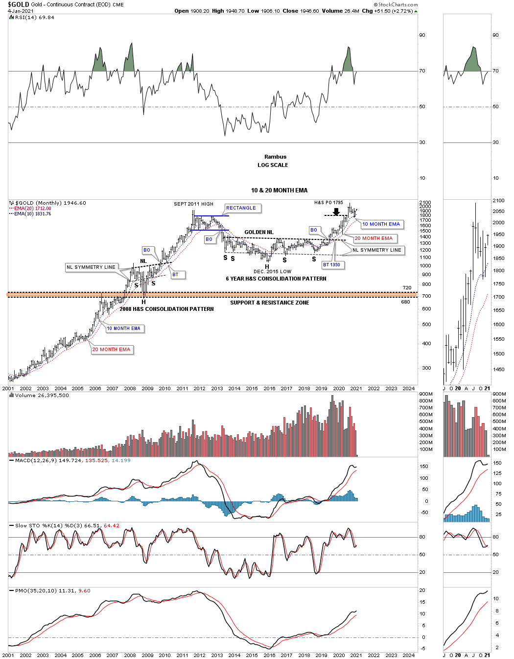
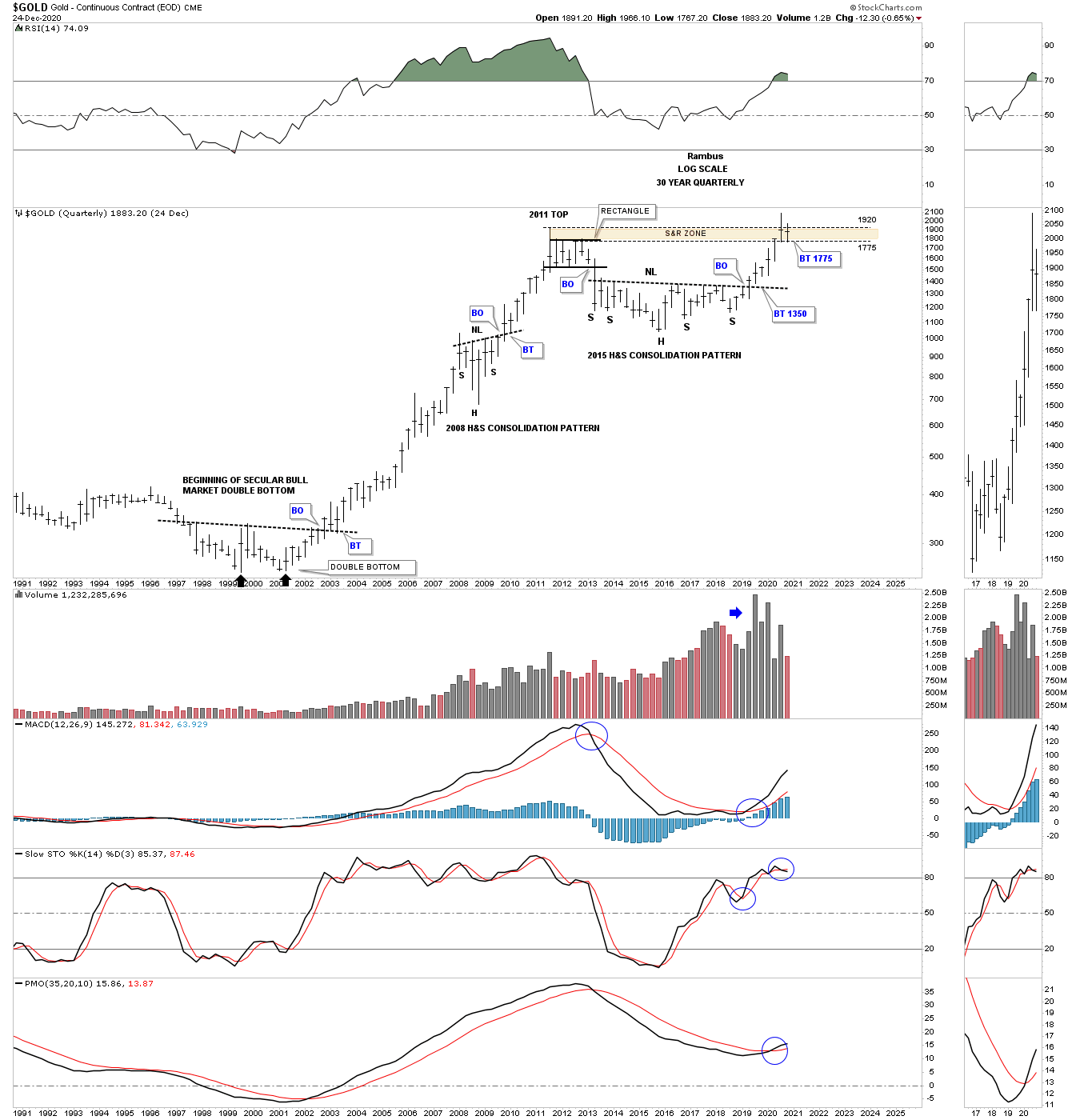
We’ve often discussed how Gold is in a long term secular bull market similar to what the US stock markets are showing us. This long term monthly chart shows the first leg up in Gold’s secular bull market that ended at the September 2011 high. You can see on this log scale chart that Gold’s bull market produced a parabolic rally which shows extremely strong price action. Our current massive H&S consolation pattern is showing the possible halfway point in the secular bull market that began back in 2000.
This next long term monthly chart for gold is just an uncluttered look at Gold’s 2000 bull market that started with the large double bottom in 2000 and the massive H&S consolidation pattern which is leading Gold higher in the 2nd half of its secular bull market. You can also see the possible new trading range forming at the recent high.
Gold’s possible reverse symmetry rectangles with the 10 and 20 month ema for support.
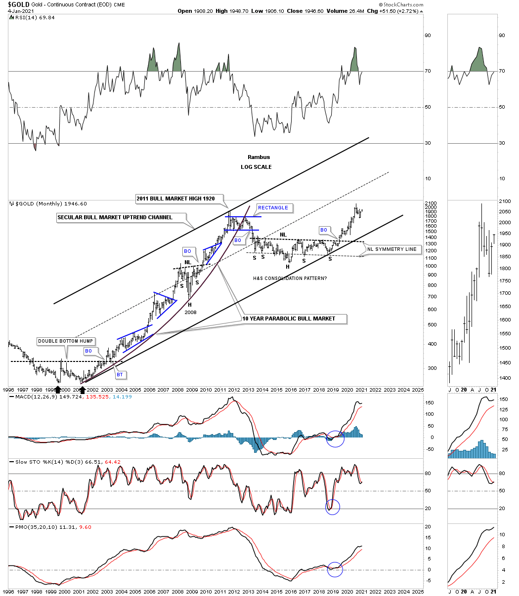
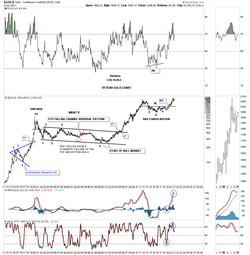
These last few charts are very long term which are needed to put our current price action in perspective. This first chart begins with the blue expanding triangle that formed as a halfway pattern in Gold’s parabolic run to its 1980 high which formed a double top reversal pattern to end that secular bull market. Gold then went on to form that massive 5 point falling channel reversal pattern that ended that bear market. This chart also shows you how clearly that massive H&S consolidation stands out like a sore thumb now.
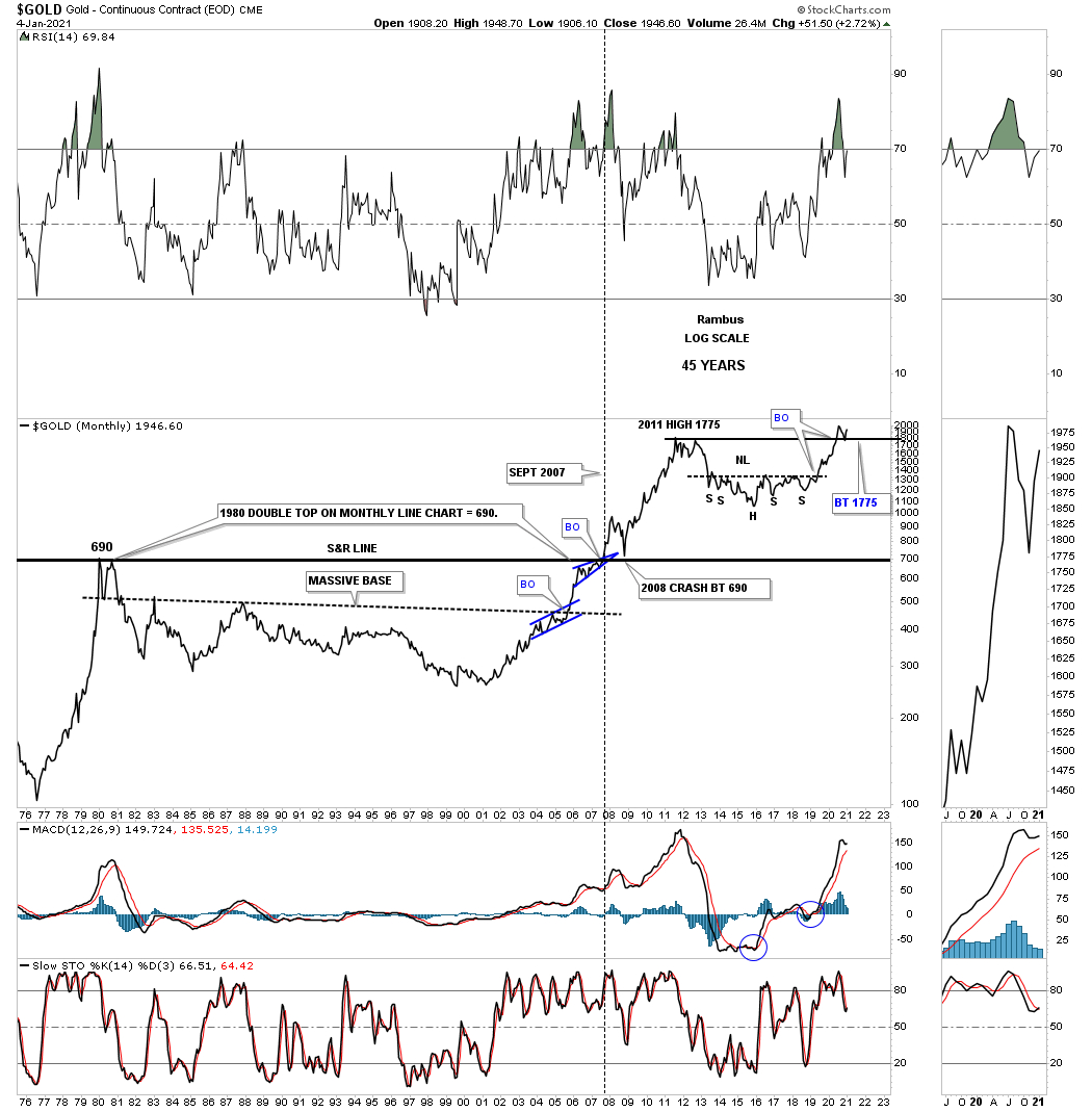
Next is a long term monthly line chart which shows you a slightly different perspective off the 1980 double top high. I mentioned earlier that one of the most basic concepts for Chartology is how a resistance line will reverse its role to support once broken to the upside. Note the heavy black horizontal S&R line that runs through the chart. We’ve looked at many charts in the past which shows us when we see a smaller consolidation pattern forming just below an important resistance line it will give the stock the energy it needs to finally take out overhead resistance, see the blue bullish rising wedge just below the S&R line. Now note where the 2008 crash found support, exactly where you would expect to see it. The last point I would like to make on this chart is the current price action. As you can see Gold has broken out to new all time highs and is now in backtest mode to the 2011 high.
Now lets look at a long term quarterly line chart which takes out almost all of the noise a bar chart can make. Keep in mind a Quarterly line chart just uses the quarterly close in which to connect the previous quarterly close. Note that during the bull market years Gold almost never made a quarterly low and if it did it was very small except of the 2008 crash low. This chart also shows you some beautiful reverse symmetry after the breakout from the massive H&S consolidation pattern. The RSI at the top of the chart shows you how long gold can stay overbought during a bull market. The black rectangles are exactly the same size which shows there is a lot of room from the RSI perspective that Gold could rise before getting extremely overbought. Note the negative divergence that formed at the 2011 high vs the RSI. The last point I would like to make is how the recent breakout above the 2011 high could see a backtest to the all time high horizontal trendline which would show all the work is now done.
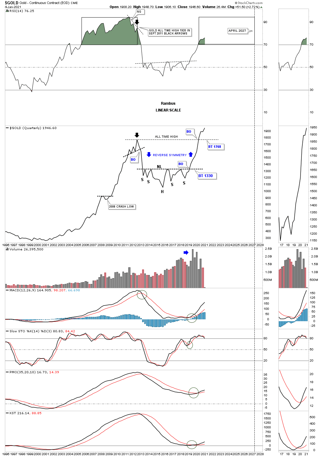
Below is the exact same chart as the line chart above but this is a bar chart with all the trendlines still in place. This bar chart shows the backtest has completed, hitting the 2011 high S&R line on the money. We now have 2 full quarters of gold trading above its 2011 high with the 3rd quarterly bar now underway.

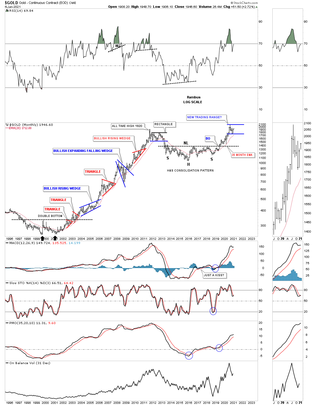
This last chart for tonight is a Quarterly bar chart which shows some simple but beautiful Chartology. Note the massive base that formed at the bear market low in the late 1990’s and early 2000’s which launched the first half of the secular bull market. Now compare that base to the most recent 2015 H&S consolidation pattern. If the 2000 based launched a 10 year bull market then there is no reason that the 2015 H&S base can’t do the same thing. Big patterns lead to big moves.
All these charts above should give you a pretty good understanding of Gold from the short term to the long term Quarterly charts. If one is only focuses on the short term charts they miss the big picture which plays an important part from the long term perspective. Understanding the big picture you can then drill down to the shorter timeframes to fine tune the charts. All the best…Rambus
Related Reading:
- Rambus: Blockbuster Chartology – October, 2020
- Rambus: Blockbuster Chartology – July, 2020
- Rambus: Blockbuster Chartology – May, 2020
- Rambus: Blockbuster Chartology – January, 2020
- Rambus: Blockbuster Chartology – October, 2019
- Rambus: Blockbuster Chartology – July, 2019
- Rambus: Blockbuster Chartology – April, 2019
- Rambus: Blockbuster Chartology – January, 2019
- Rambus: Blockbuster Chartology – October, 2018
- Rambus: Blockbuster Chartology – July, 2018
- Rambus: Blockbuster Chartology – April, 2018
- 2017 Annual Wrap Up – Does Your Pension Fund Have A Deep State Drain? – January, 2018
- 1st Quarter Wrap Up 2018 Web Presentation
- Blockbuster Chartology with Rambus – October, 2017
- Blockbuster Chartology with Rambus – July, 2017
- Blockbuster Chartology with Rambus – May, 2017
- Blockbuster Chartology with Rambus – January, 2017
- Blockbuster Chartology with Rambus – October 20, 2016
- Blockbuster Chartology with Rambus – July 21, 2016
- Blockbuster Chartology with Rambus – April 21, 2016
- Rambus: Are We in a Deflationary Spiral? – January 28, 2016
- The Dollar, Gold & the S&P 500 with Rambus – October 15, 2015